 © 2026 Keke LE Design
© 2026 Keke LE Design
© 2026 Keke LE Design
2025
Alibaba Group, Taobao
UX Design
Taobao is an online shopping platform product that brings a high-quality online shopping experience to morethan hundreds of milions of users. it meets the needs of global consumers to search and browse products, addto cart, order and pay, check logistics, communicate with customer service, post shopping reviews, share highguality products, and get local life discount information. Taobao Vision provides complete shoppingfunctionality and fuly applies Vision Pro spatial computing, shared space, 3D, eye movement and bare handsfeatures to bring users a more intuitive, immersive, open and enjoyable shopping experience.
Familiar. The shopping function and usage path meets the user's habit, providing functions such as browsing, searching, viewing products, consulting with sellers, ordering, and orders inquiring. Adding new experiences suitable for mixed reality behavior and perception under each function stage.
Usable. Returning to the shopping demand itself, excavate the past problems that can be solved or the experience that can be enhanced by the content display and interaction mode under the mixed reality headset, in order to provide practical functions of device applicability, dependence and durability. Avoid the pursuit of novelty without practical value of short-term experience.
Intuitive. Presentation and operation of window interfaces, product models, and image contents are subject to the user’s intuition. Utilizing the wide spatial canvas to rationally display related information and operations.
High Fidelity. The quality of product modeling, display in real space, and image content must be closer to reality, further reducing consumer decision-making costs.
Effortless. Fully consider the user's usage scenario and gesture behavior to ensure low-cost cognition and low-fatigue operation. Basic interaction universality, global consistency of navigation controls, spatial continuity of front and back level containers, content display and operation controls in the center of the field of view, small moment gesture operation, multi-window container management, safety zone and extreme situation consideration, operation guidance and hints, global adaptive layout of the window, and shared-to-exclusive hints and exit mechanism.
Behavioral Design ↑
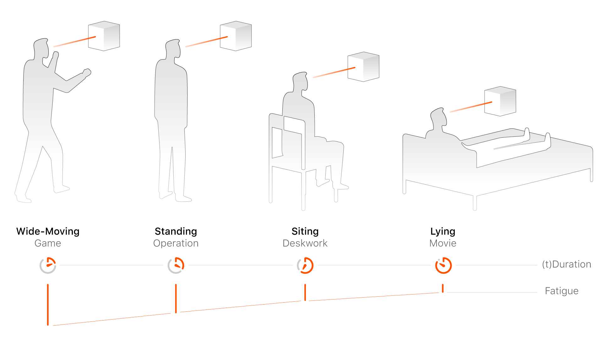
There exists an inverse relationship between users' duration of use and their level of physical fatigue. Applications that require large-scale bodily movements (such as motion-based games) tend to have shorter usage durations, whereas passive experiences like watching films in a reclining position allow for longer engagement.
In the context of shopping applications, even though certain interactive features (such as product placement through spatial gestures) may require more extensive user motion, the overall experience should be optimized for a seated posture to minimize fatigue and enhance comfort.
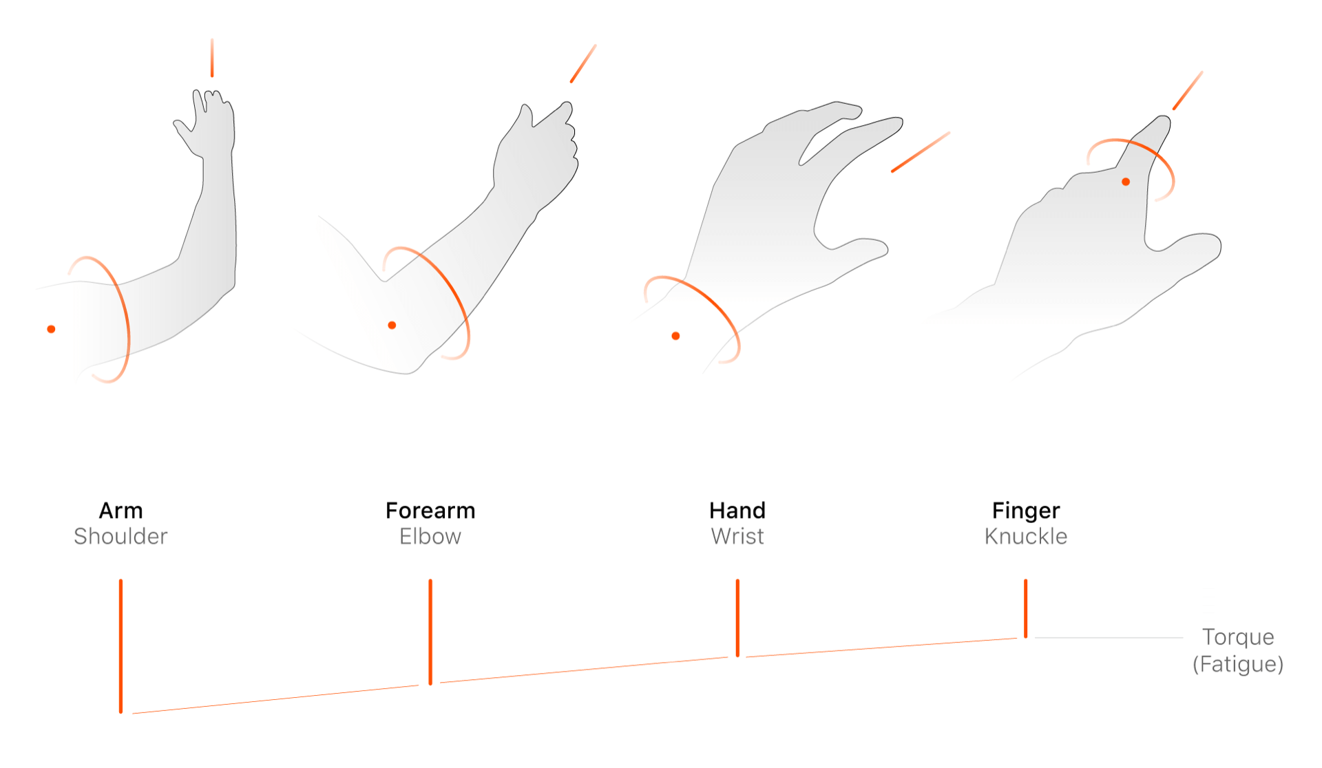
Variations in gesture amplitude also lead to changes in torque, which directly influence user fatigue. Designers should avoid interaction models that use the shoulder as a pivot point or require rotation of the entire arm, as these generate longer moment arms and higher torque, thus demanding greater physical effort. Instead, interaction gestures should be designed to rely primarily on wrist or finger movements, which are more efficient and sustainable for prolonged use.
Usability Design ↑
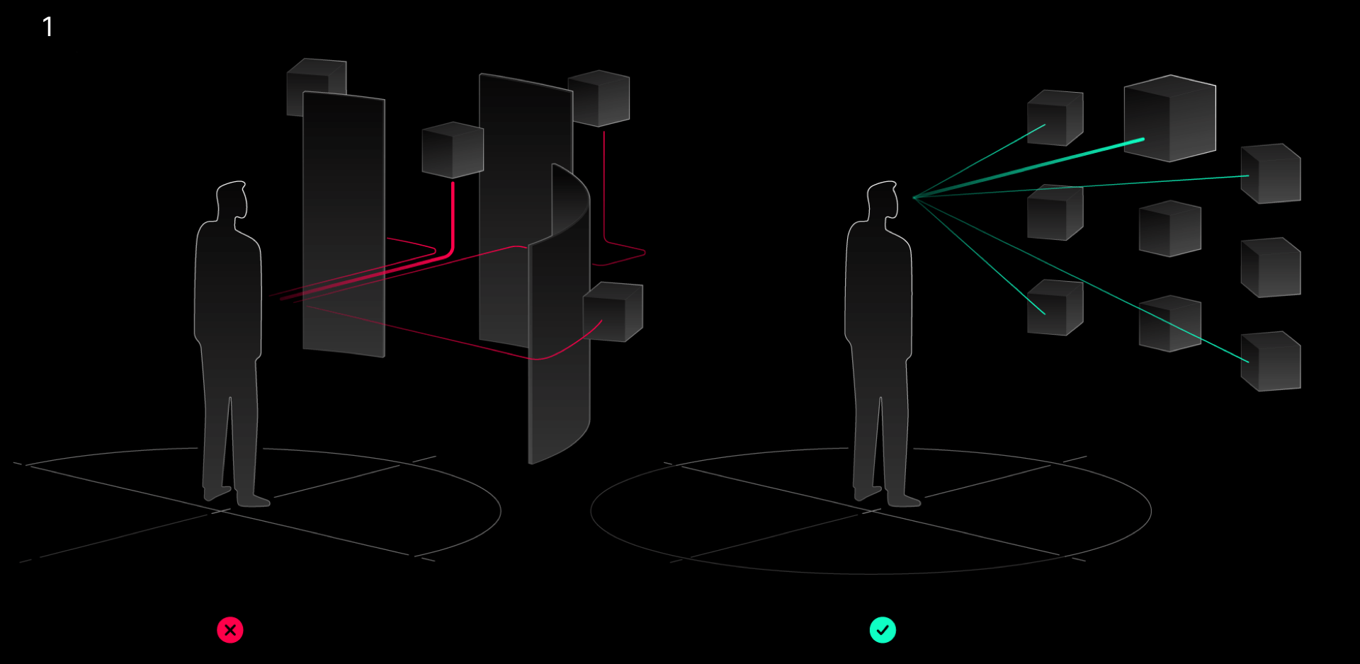
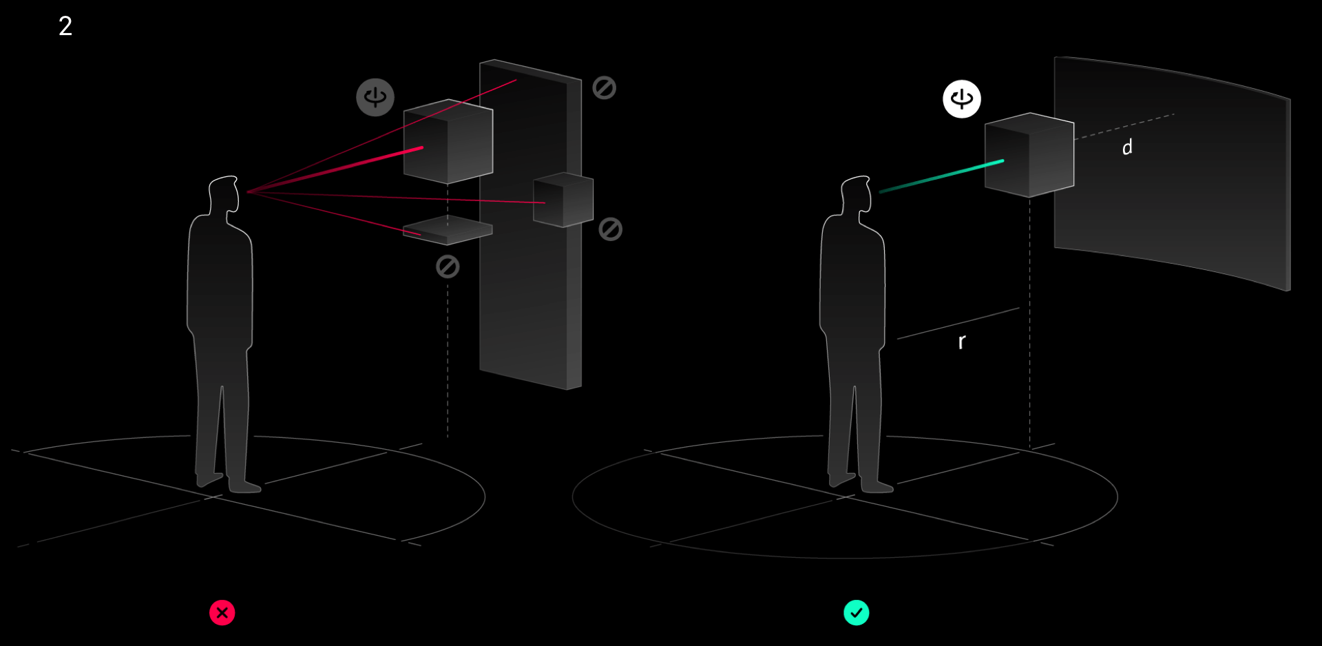
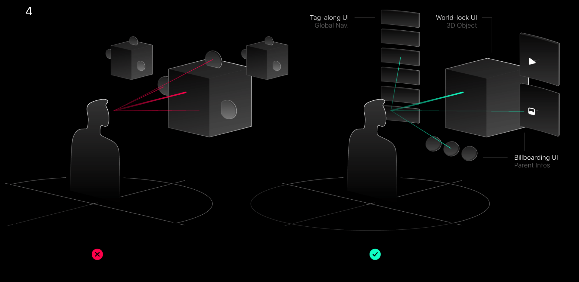
1-Directly Reach. Enhance the direct accessibility of interactable objects, reduce ineffective and time-consuming orientation perception and search, the visibility and reachability of all objects within FOV should be equalized as much as possible.
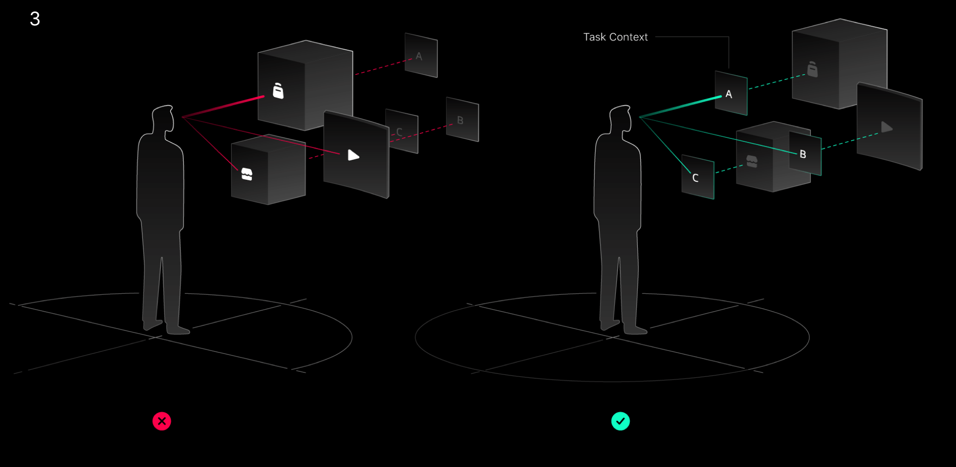
2-Object Perception. Enhance the subjective perception of interactable objects, reduce the information interference of spatial atmosphere, auxiliary information and other factors.
3-Task Perception. Ensure that the functionality, spatial containers, and operational interface design to realize individual tasks are complete and are clearly communicated to the user in the navigation.
4-2D & 3D Combination. Always use efficiency as a judgment to determine whether to display information interactively in 3D or 2D, do not abuse 3D elements.
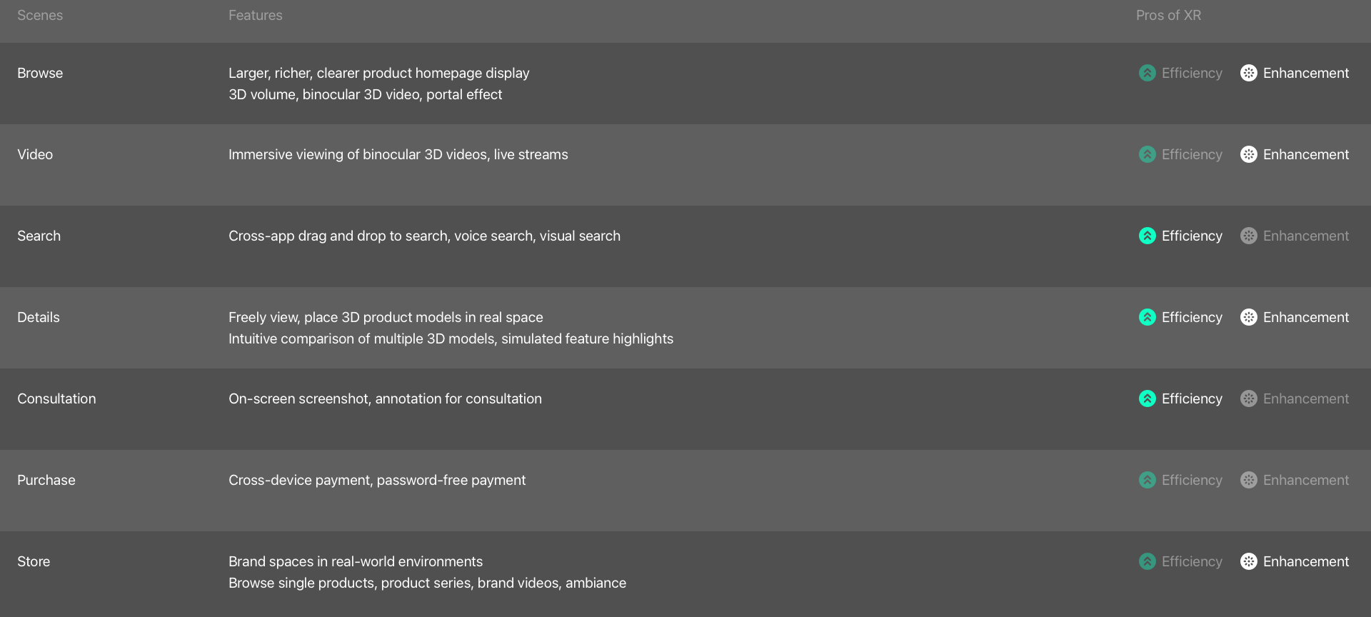
Overview of Features ↑
Functions are designed for each stage of the user's shopping journey, some of which leverage mixed reality to enhance efficiency (for example, freely viewing 3D product models, placing them in real environments, intuitively comparing multiple 3D models, or simulating product highlights). Others serve primarily to enrich the immersive experience, such as stereoscopic product displays on the home page or binocular 3D live streaming.
Product Hierarchy Planning ↑
Once the key functions are defined, the next step in building a complete application is to organize them into a navigational structure aligned with the user's journey. Following the principle of familiarity, primary-level sections include product flow, search, and video, with the home page continuing to serve as the hub for product distribution. Secondary-level sections comprise product details, brand spaces, and multi-product comparison. The overall hierarchy is kept within three levels to maintain clarity. Functional spaces are further categorized into shared environments and immersive environments based on their interaction characteristics.
Home Page Design ↑
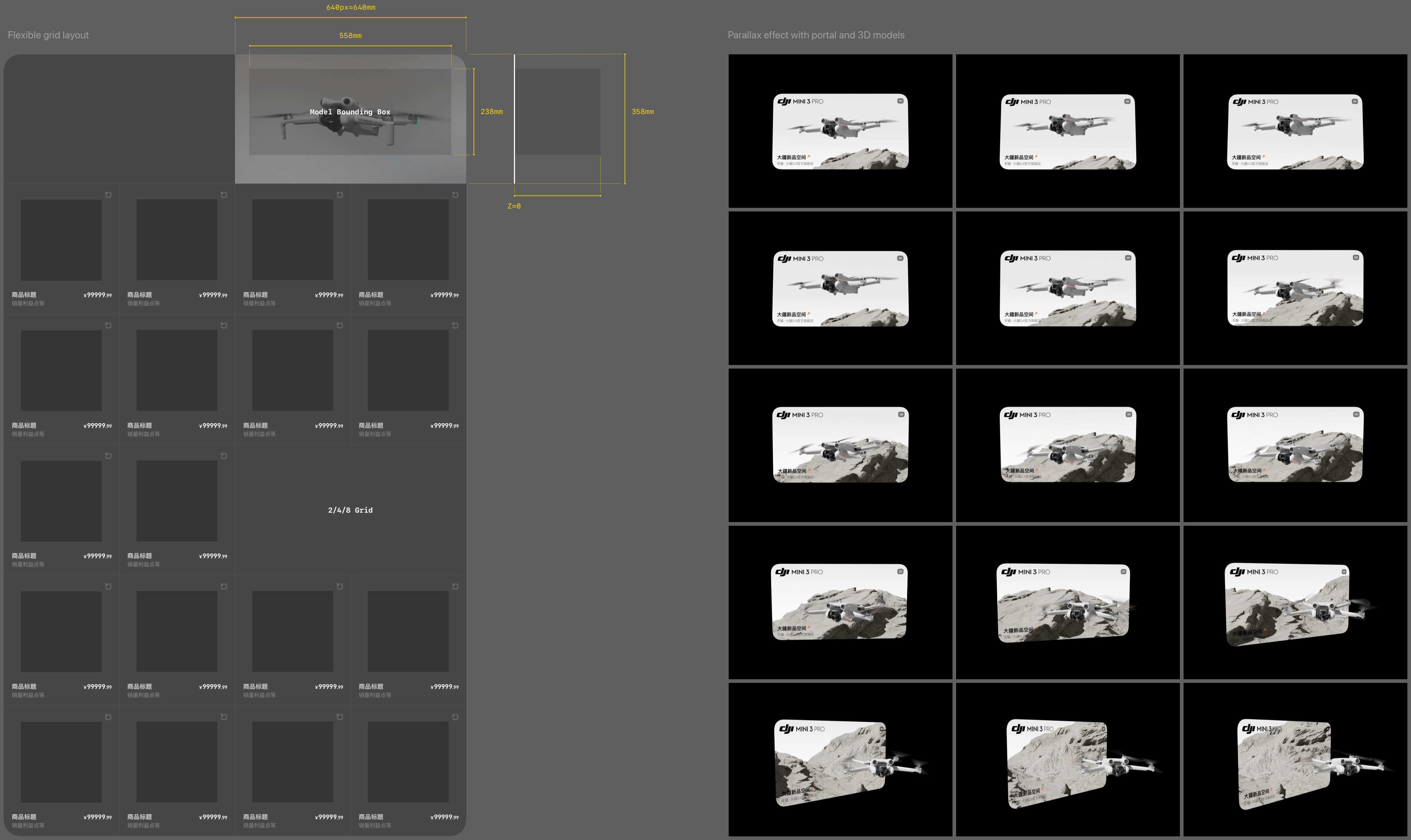
The home page product flow employs an adaptive eight-gallery layout, with two combinations forming four-gallery, two-gallery, or single-gallery displays for 3D product models or Portal effects. Bounding box dimensions and Z-axis offsets are predefined. Given the integration of 100,000 products, existing white-background images are used instead of rendering each product in 3D within the homepage grid. This approach reduces production costs while ensuring the home page remains efficient for rapid product browsing and distribution.
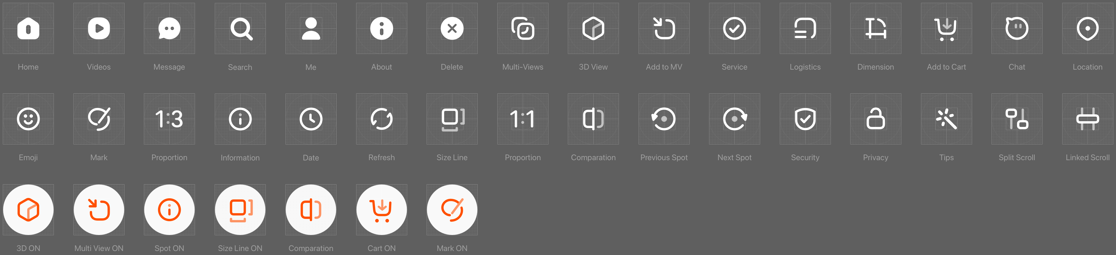
Icon Design ↑
New button icons were created to accommodate spatial interaction features distinct from those on mobile and desktop platforms.
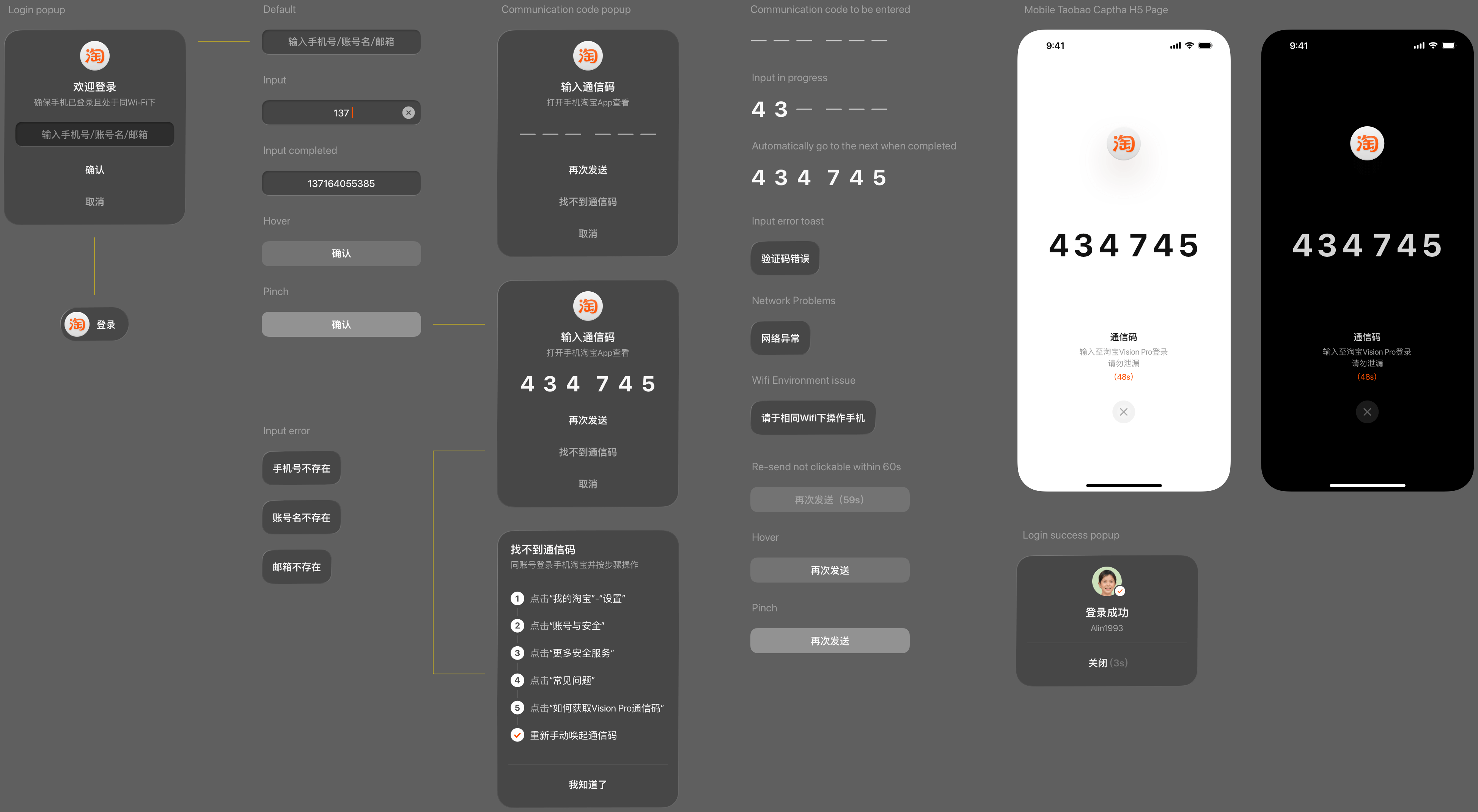
Login Design ↑
Users enter their phone number to receive a verification code on the mobile Taobao app, which is then inputted in the AVP to complete dual-end linked login.
Login Flow and Component Design ↑
The mobile push verification interface was redesigned to eliminate the need for entering passwords, emails, or other cumbersome information, allowing users to clearly view numerical codes through the VST without removing the headset. The entire login flow, including exception states, was designed using visionOS components.
3D Layout Design ↑
The product detail page is a key experience scenario in the Taobao Vision Pro version. It primarily consists of a combination of the product model and information panels, displayed within an immersive environment. Product models support functions such as placement, rotation and scaling, color switching, highlighting selling points, displaying dimensions, and multi-product comparison. The default positions and sizes of the product models were carefully designed as the first step.
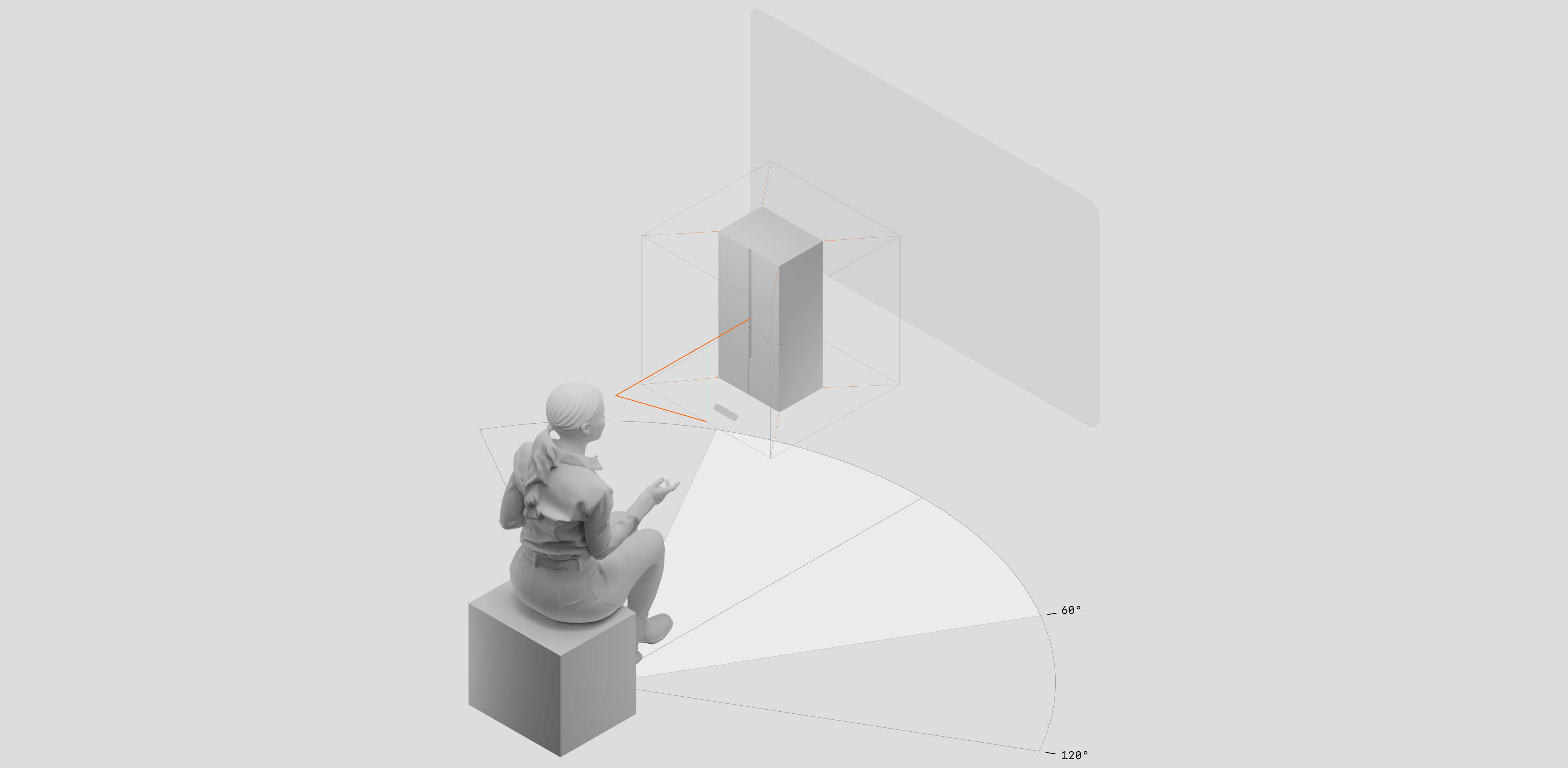
Product Model Positioning ↑
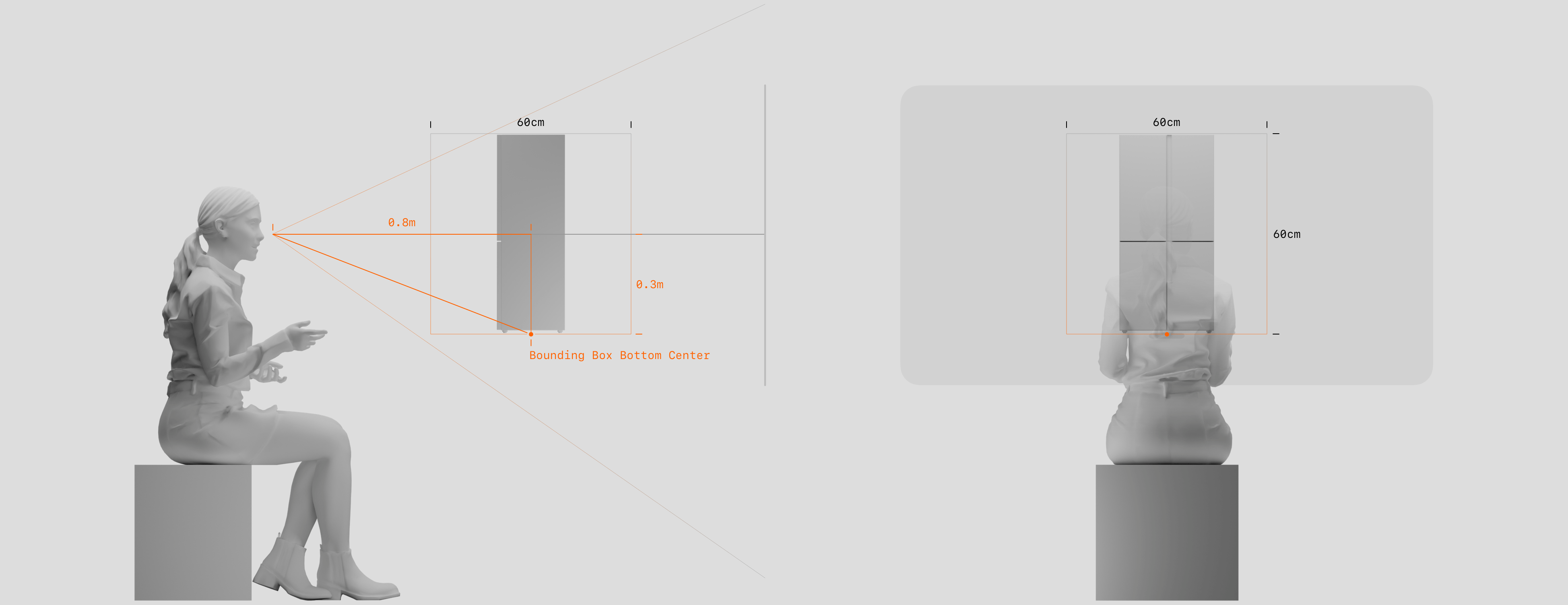
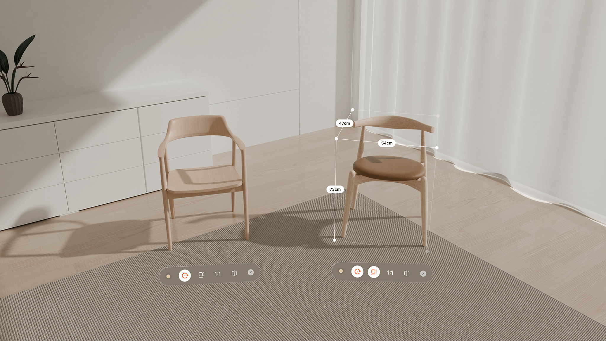
Using the headset position (eye level) as the reference point and covering the central forward field of view, the spatial relationship between the user, the model, and the information panels is established to ensure visibility, operability, and non-overlapping arrangement. Following the principle of object perception, the model's center is positioned 0.8m in front of the headset center, with the model's base 0.3m below.
Product Model Size (Small to Medium) ↑
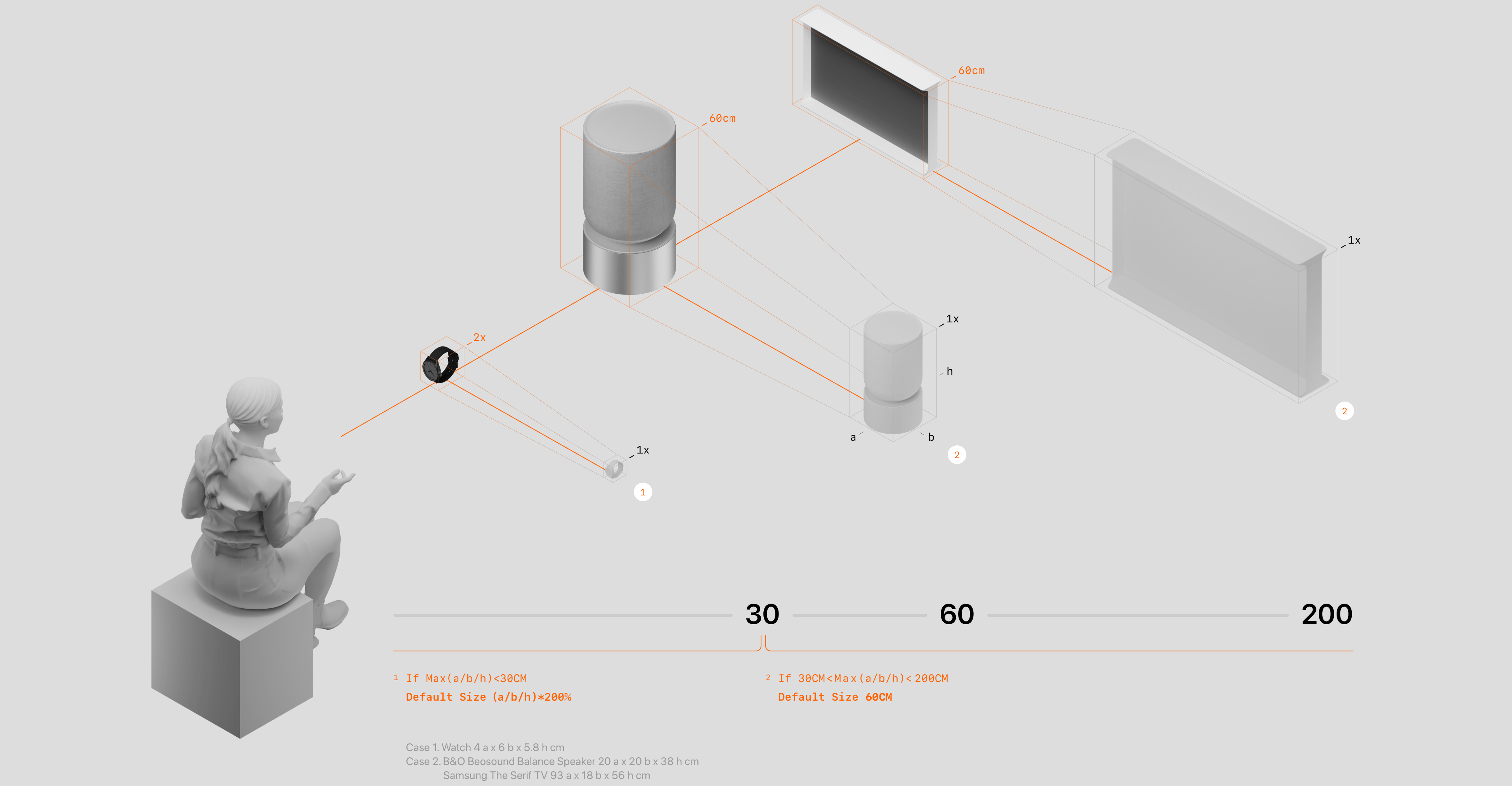
Given the wide variety of product categories and size ranges, a 1:1 default scale would make small items difficult to notice (e.g., rings, watches) and large items unwieldy to interact with or partially intersect with the user or interface panels (e.g., furniture, vehicles). Therefore, the default display size rules for product models are defined as follows:
If the longest dimension of a model is less than 30cm, it is displayed at double scale.
If the longest dimension is between 30cm and 200cm, it is displayed at a size of 60cm.
Product Model Size (Large) ↑
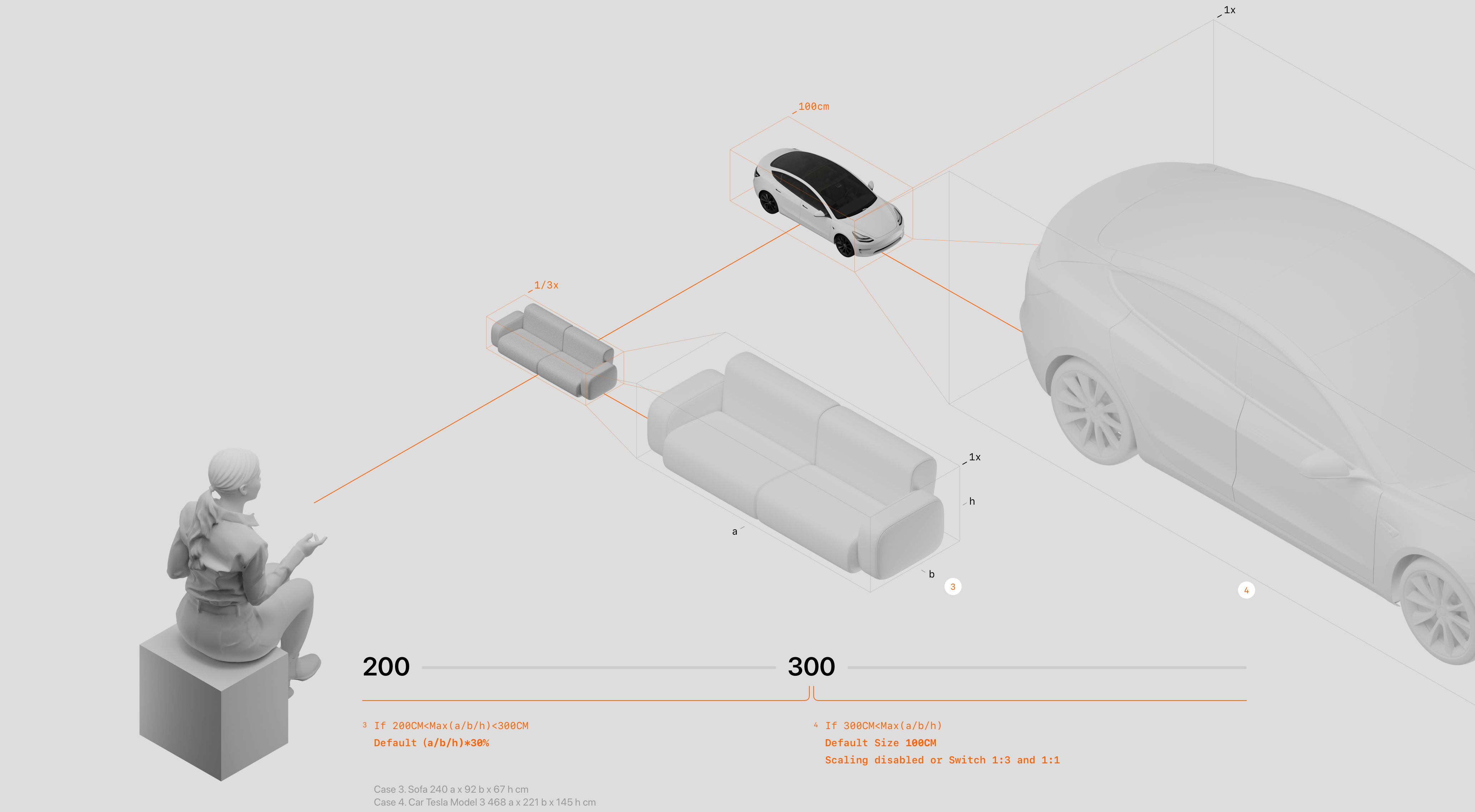
If the longest dimension of a model is between 200cm and 300cm, it is displayed at one-third of its original size.
If the longest dimension exceeds 300cm, it is displayed at a default size of 100cm, with scaling disabled.
Product Model Scaling Design ↑
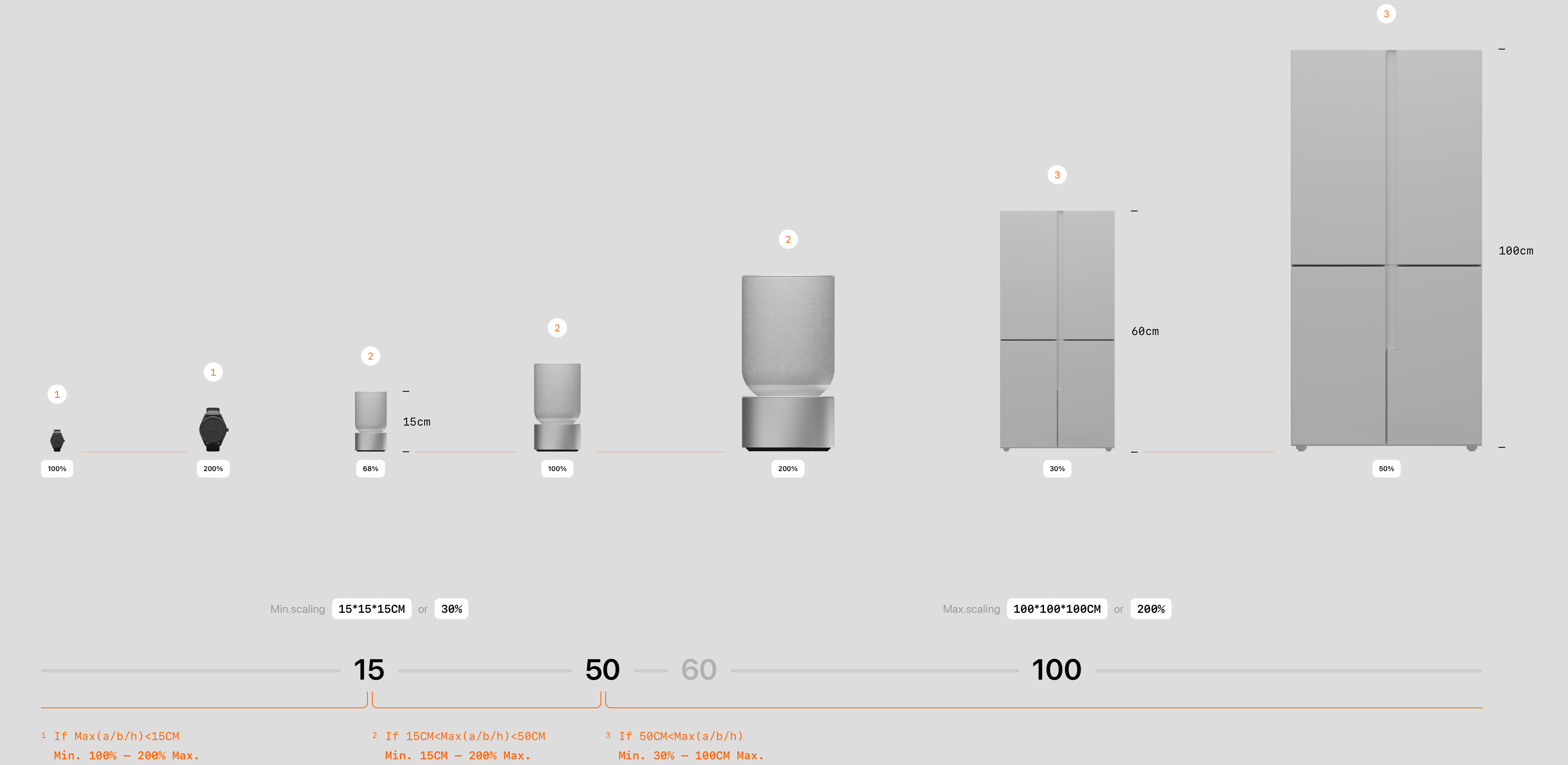
User-initiated scaling allows for detailed observation of products. To prevent models from becoming too large and intersecting with the user or interface panels, or too small to manipulate, the following tiered scaling rules are applied based on product size:
1-For models with a longest dimension under 15cm: maximum scale ×2, minimum scale 1:1.
2-For models with a longest dimension between 15cm and 50cm: maximum scale ×2, minimum scale such that the longest dimension is 15cm (68% of real size).
3-For models with a longest dimension over 50cm: maximum scale such that the longest dimension is 100cm, minimum scale 30% of real size.
Additionally, a 1:1 button is provided for users who wish to view the product at actual size. For large items, this action enlarges the model away from the user as expected.
Screenshot of Product Model Display ↑
1: Default display state of the model in the product detail page.
2: 1:1 display mode for large products.
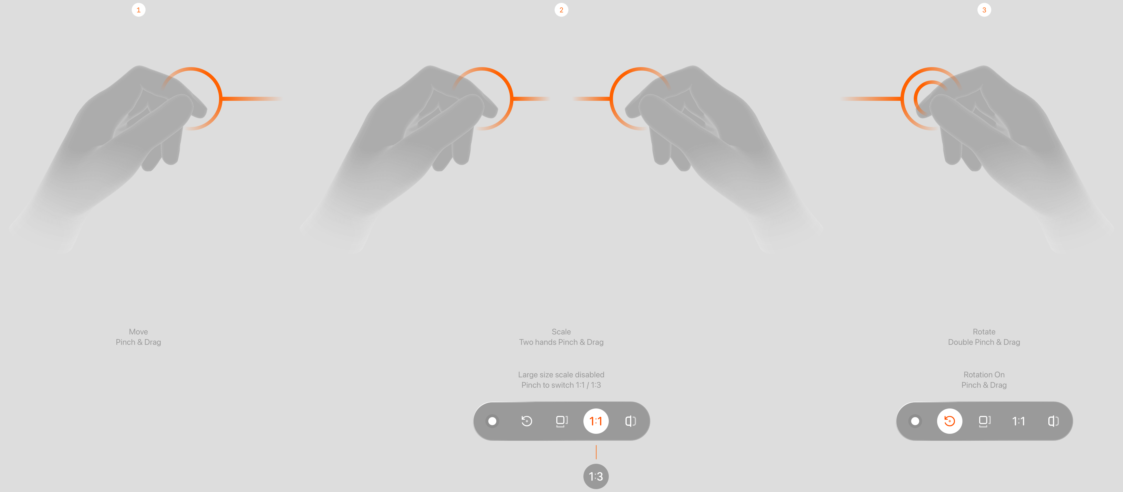
Gesture Interaction ↑
Interaction gestures are designed based on intuitive habits, operation frequency (move > rotate > scale), and fatigue management (single-hand > dual-hand) to ensure gestures do not conflict and that a single gesture does not trigger multiple responses simultaneously.
Dual-hand rotation can conflict with dual-hand vertical scaling.
A rotation toggle control is added to switch between single-hand pinch for moving and rotating functions. Quick gestures, such as pinch followed by a double drag, can also trigger rotation directly.
A real-size toggle control simplifies scaling operations. Free scaling is disabled for large products, as excessive enlargement makes models difficult to manipulate.
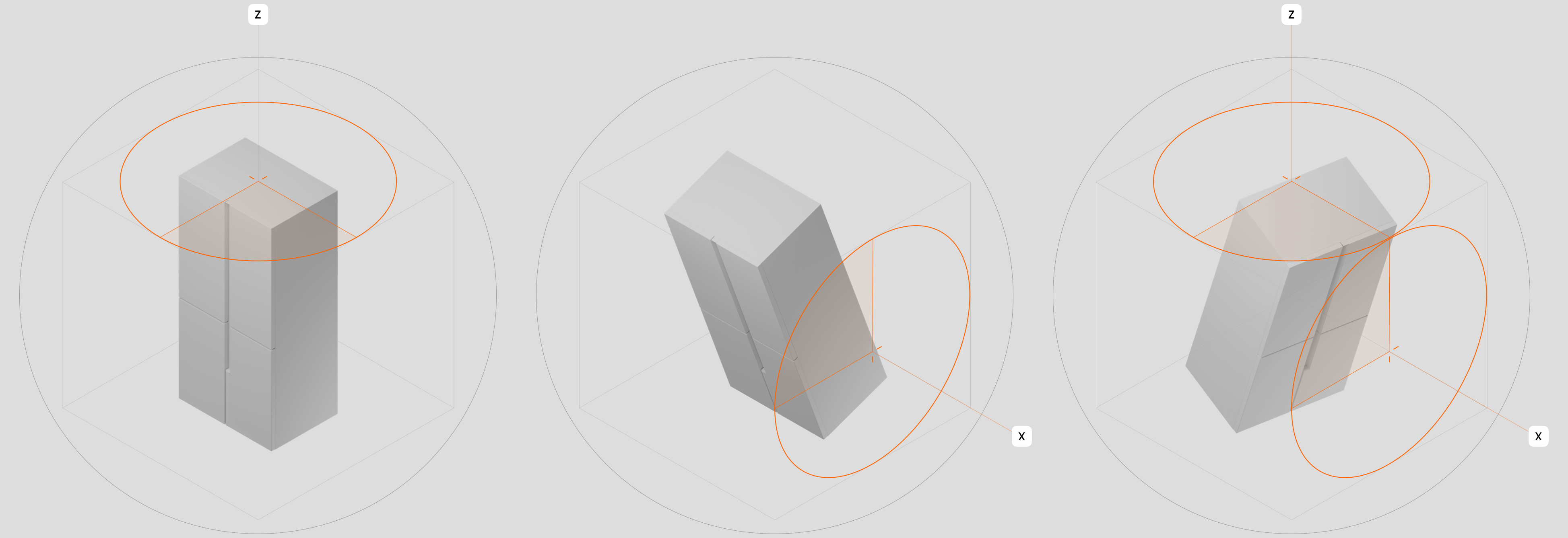
Product Model Rotation Design ↑
The model can rotate along the X-axis to view front and back details, and along the Z-axis to view left and right details, allowing inspection from all angles. After a pinch-and-release gesture, the model continues to rotate along the Z-axis with inertia before stopping, while the X-axis automatically returns to the default angle (0°). To accommodate this release-and-reset behavior, the model is designed to rotate sufficiently within a limited arm swing to reveal at least the back side (180°). Finally, rotation speed is optimized to convey a sense of product weight.
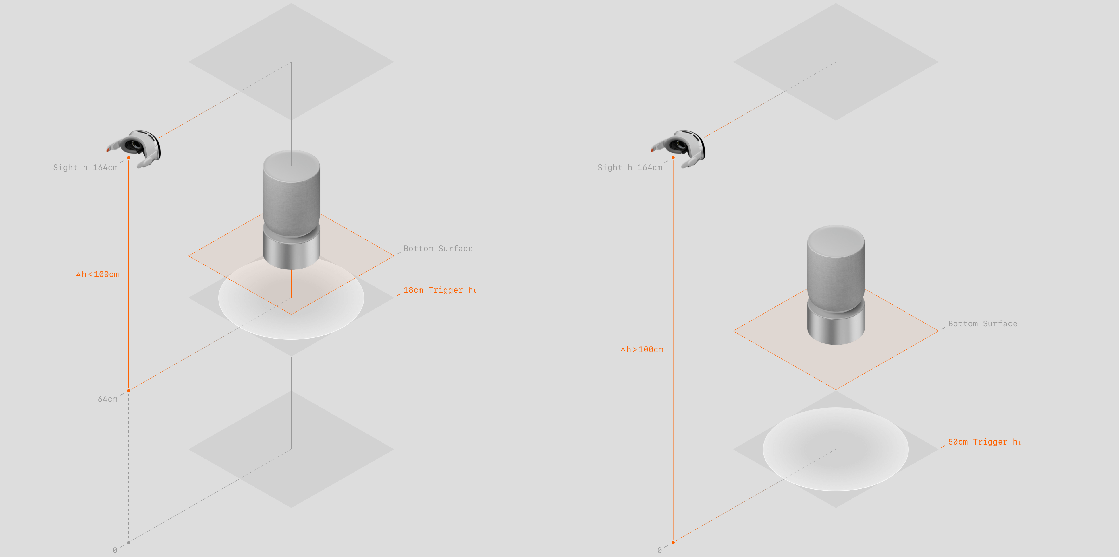
Product Model Placement Design ↑
Users can use pinch-and-drag gestures to move the model near the floor. Once the placement cue is triggered, releasing the model causes it to automatically drop onto the surface. If the surface is less than 100cm from the headset (such as placing on a table while seated) the placement trigger distance is 18cm. If the surface is more than 100cm away (such as placing on the floor while standing) the trigger distance is 50cm. This distinction ensures sufficient floating space, preventing the model from dropping prematurely and allowing users to examine the product without interruption.
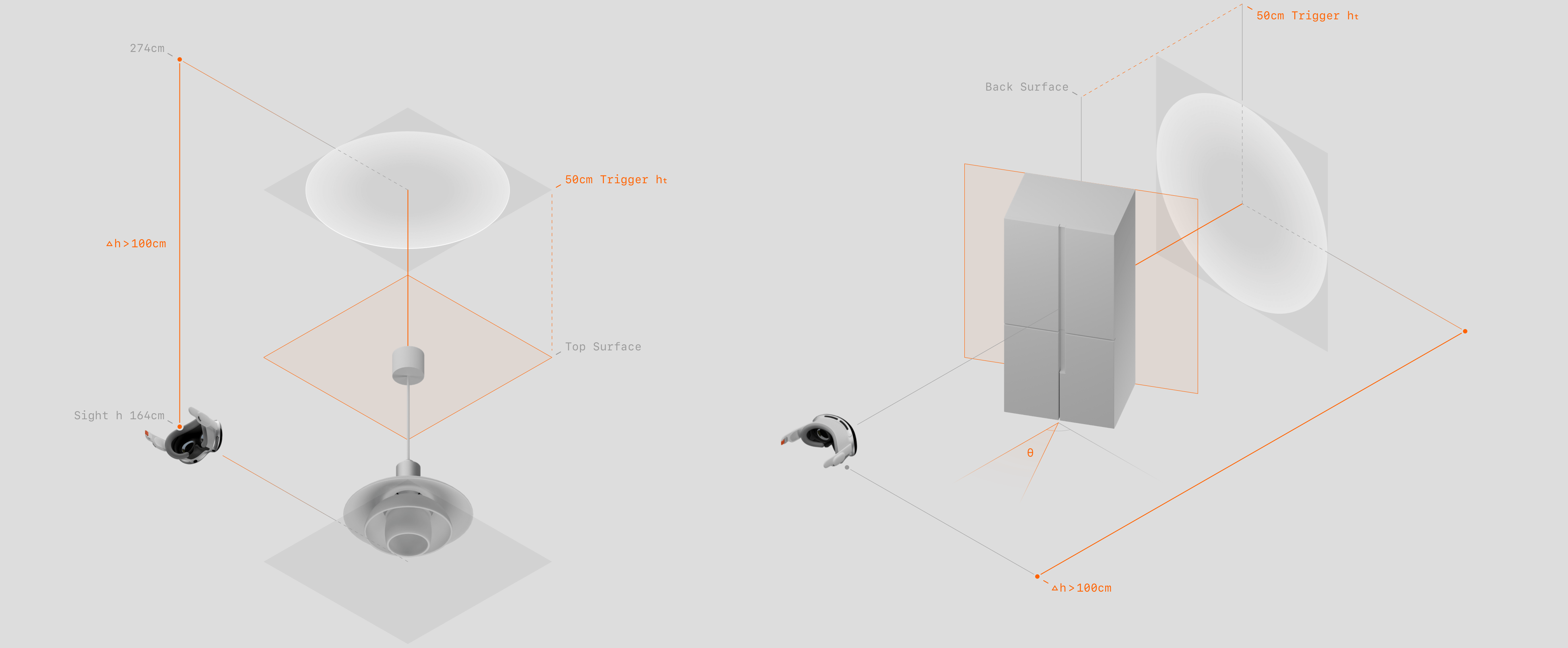
Product Model Placement Design ↑
Users can also use pinch-and-drag gestures to move the model near a wall or ceiling. Once the placement cue is triggered, releasing the model causes it to automatically snap onto the surface. Each product model is assigned a placement face during storage (for example, lamps and range hoods use the top face, while air conditioners and paintings use the back face). Based on surface detection, the model automatically rotates to align the placement face with the surface, with the model's center positioned between the placement face center and the headset center. This ensures that, regardless of angle, the model rotates to place the designated face parallel to the surface, with the front side facing the user.
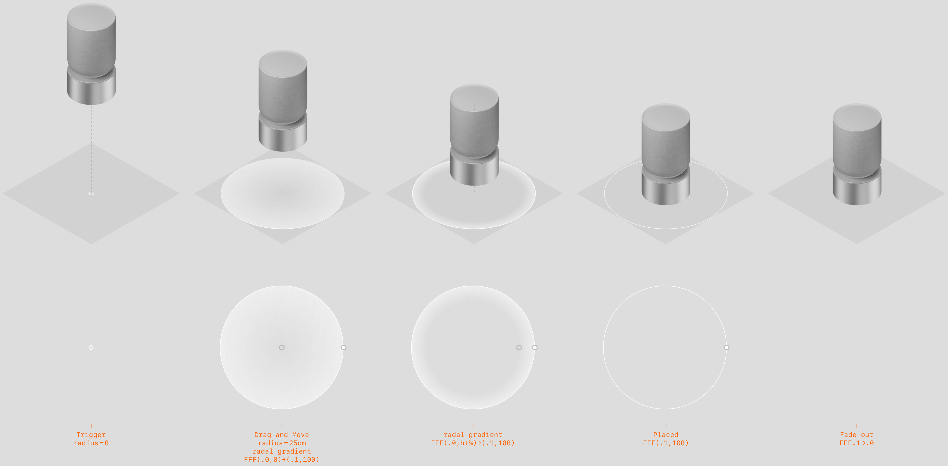
Placement Visual Cue ↑
When the model is moved within the placement trigger distance, a cue ring appears, scaling from 0 to 1 to visually correspond with the downward inertial gesture. Upon release, as the model drops or continues downward, the ring's radial gradient center shifts from 0% to the edge, reflecting the expansion of the product's bottom shadow. Once the model is fully placed on the surface, the ring becomes a thin outline and then fades out.
Screenshot of Product Model Placement ↑
1: Demonstration of the full interaction and visual cue when placing a product model on a surface.
2: Thanks to environment detection, all surfaces in the user's space are identified, enabling the placement trigger distance rules.
3: Interaction demonstration of a product model placed on the ceiling.
4: Multiple virtual product models can overlap during manipulation. Upon release, each model automatically snaps back to a non-overlapping state based on the relative positions of their centers along the movement direction.
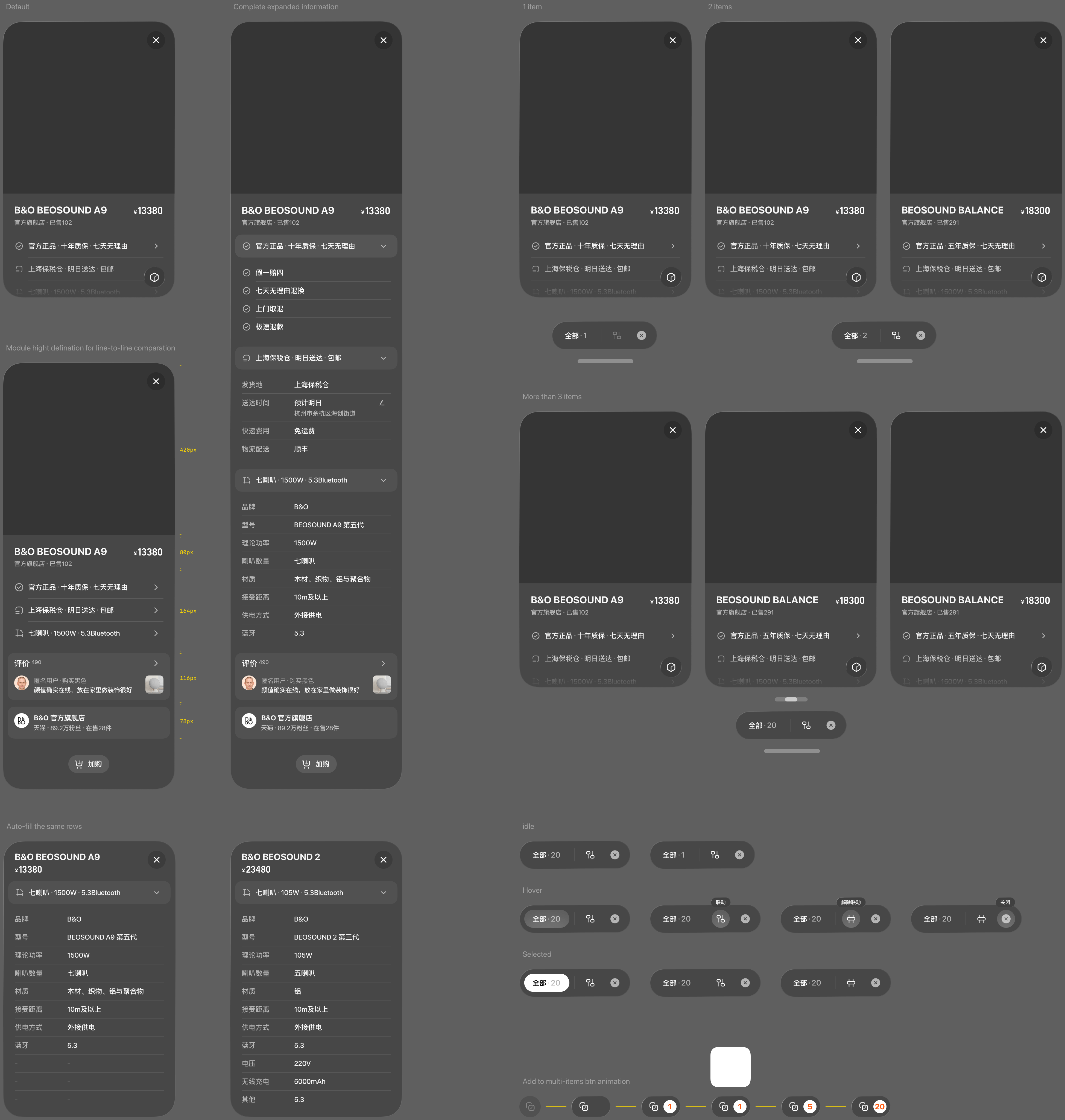
Screenshot of Multi-Product Comparison ↑
Supports the functional experience of viewing three models in the same space, while ensuring consistent global operation and interaction, and maintaining visibility and non-overlapping layout when multiple models appear by default.
1: Default positions of products in multi-product comparison.
2: Intuitive comparison of product dimensions.
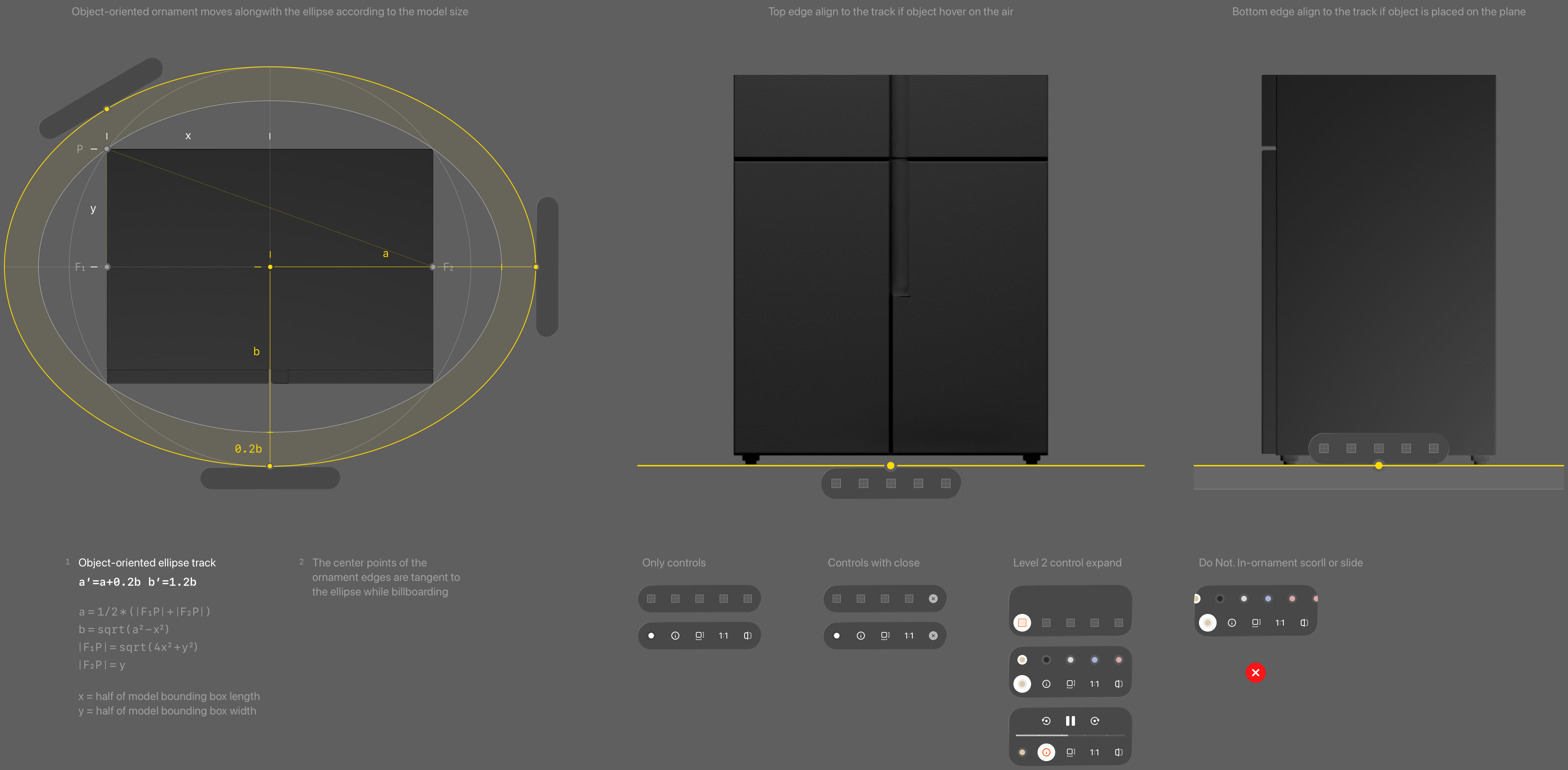
Model Toolbar Design ↑
The ornament moves along the elliptical offset track formed by the projected surface of the model. Top align to the bottom surface when the model's hovering, and bottom align to the bottom surface when the model's placed.
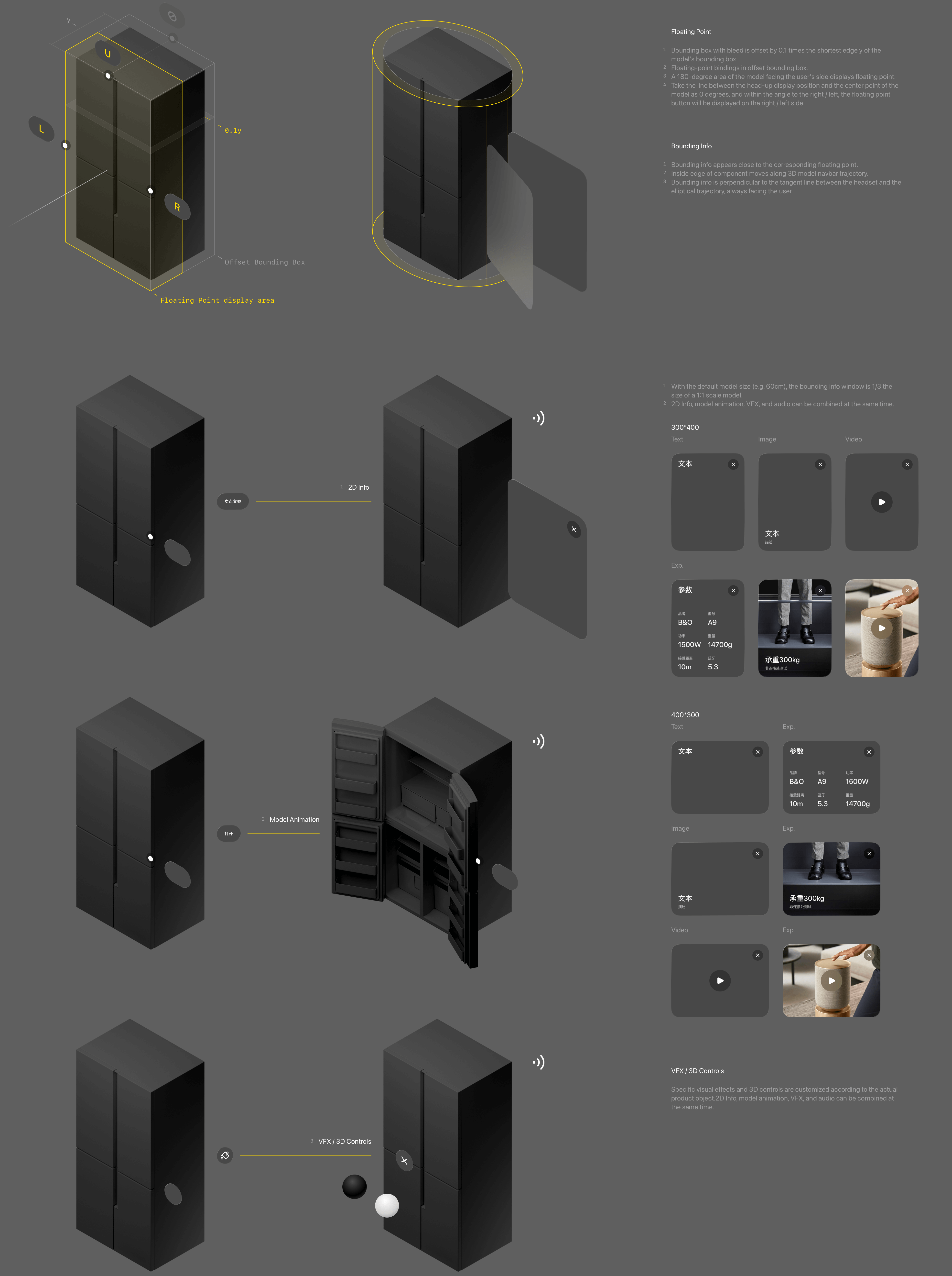
Model Auxiliary Information Design ↑
The model's offset bounding box is defined and linked to a floating point. The floating point button appears on the left or right depending on its position relative to the line connecting the model center and the headset, ensuring it is not occluded from any viewing angle. Floating points support three types of feedback:
1-Tap to display 2D auxiliary information (e.g., text, images, videos)
2-Tap to trigger model animations (e.g., open, close)
3-Tap to access 3D controls for secondary operations (e.g., switching colors or materials)
4-Any of the above types can also be linked with audio.
Screenshot of Model Toolbar and Auxiliary Information ↑
1: Secondary operations of the model interaction toolbar expanded upwards, such as the auto-play product highlight feature.
2: After tapping play, auxiliary information indicating the product highlights is displayed. Users can also manually tap anchors to explore product features.
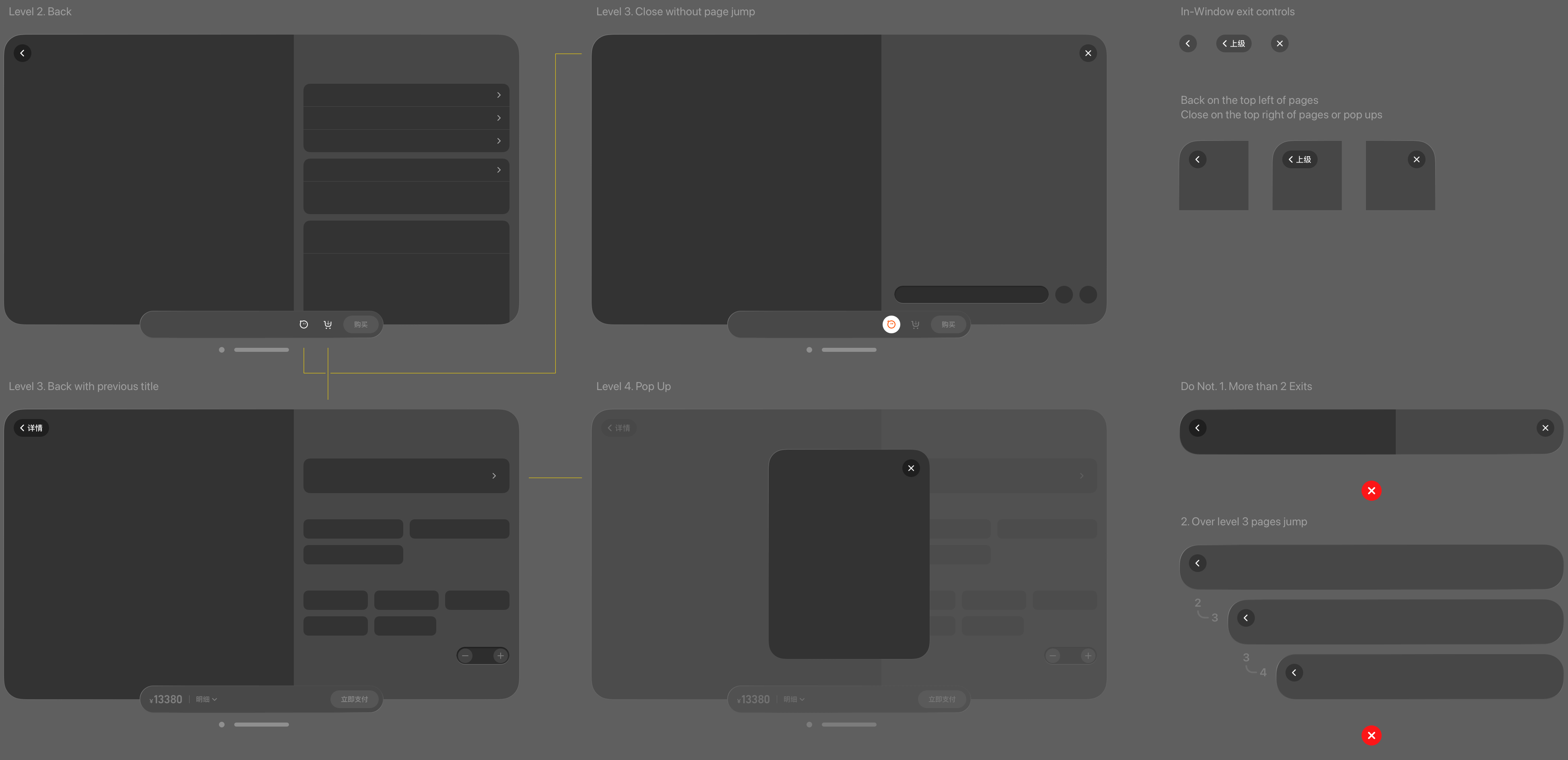
Detail Navigation Design ↑
Returning to the detail panel, the secondary-level detail page uses Ornament controls to navigate up to a third-level page within the window. In-window navigation does not exceed three levels. Additional content and operations are handled via pop-ups or overlays.
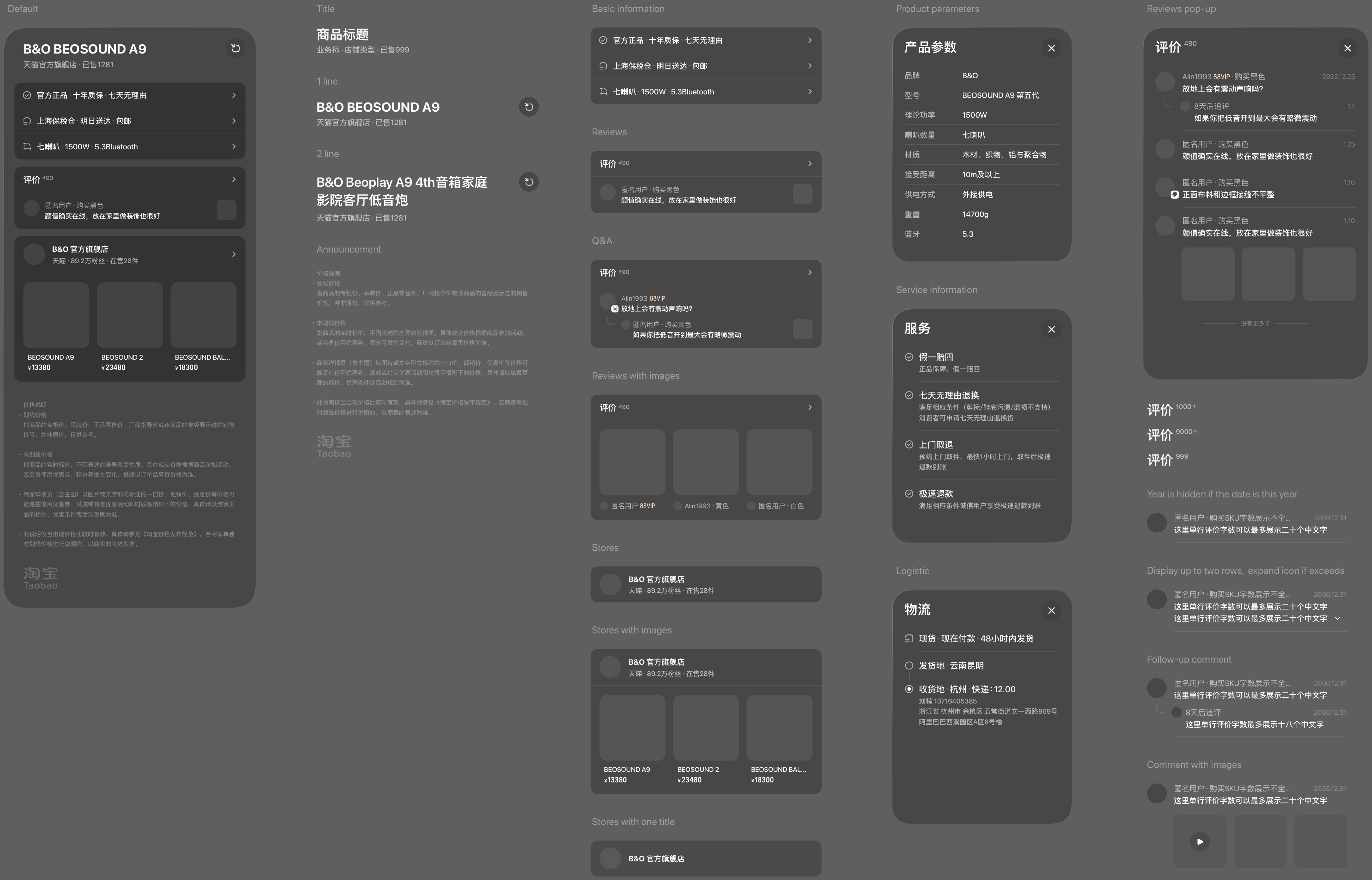
Detail Page Information Design ↑
Core information is visible in one screen, reducing redundant operations. The left and right information structure is compatible with details, messages, and transactions to maintain the consistency of reading and operating areas. Secondary information adopts popup/over to ensure that the content appears in the center of the field of view or near the trigger point, reducing the fatigue caused by head-eye rotation.
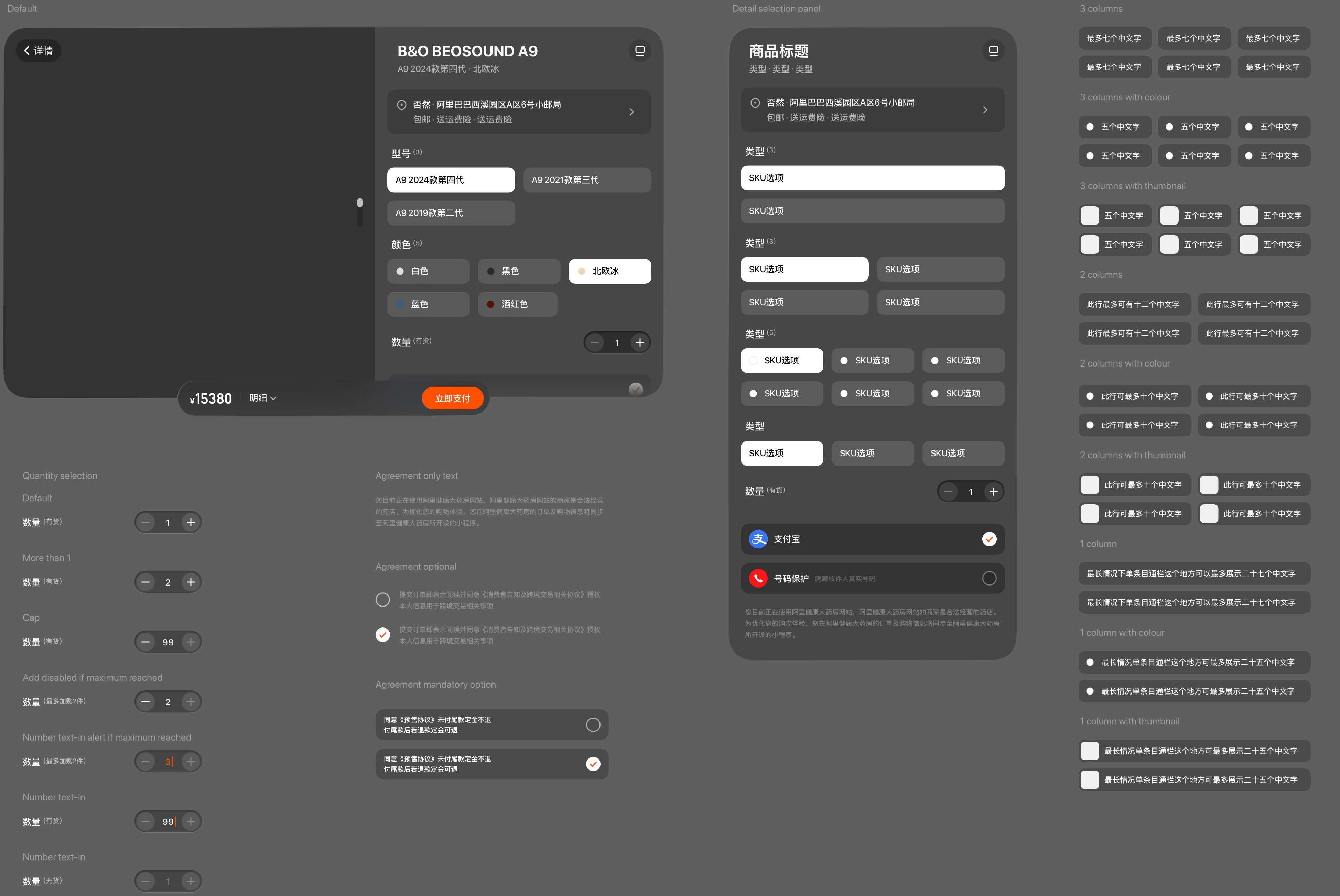
Add-to-Cart Panel Information Design ↑
Following established client-side interaction habits, users can select product SKUs, delivery address, services, and quantity, then add items to the mobile shopping cart or proceed directly to payment. For easier selection, SKU options are arranged in rows of one, two, or three based on text length.
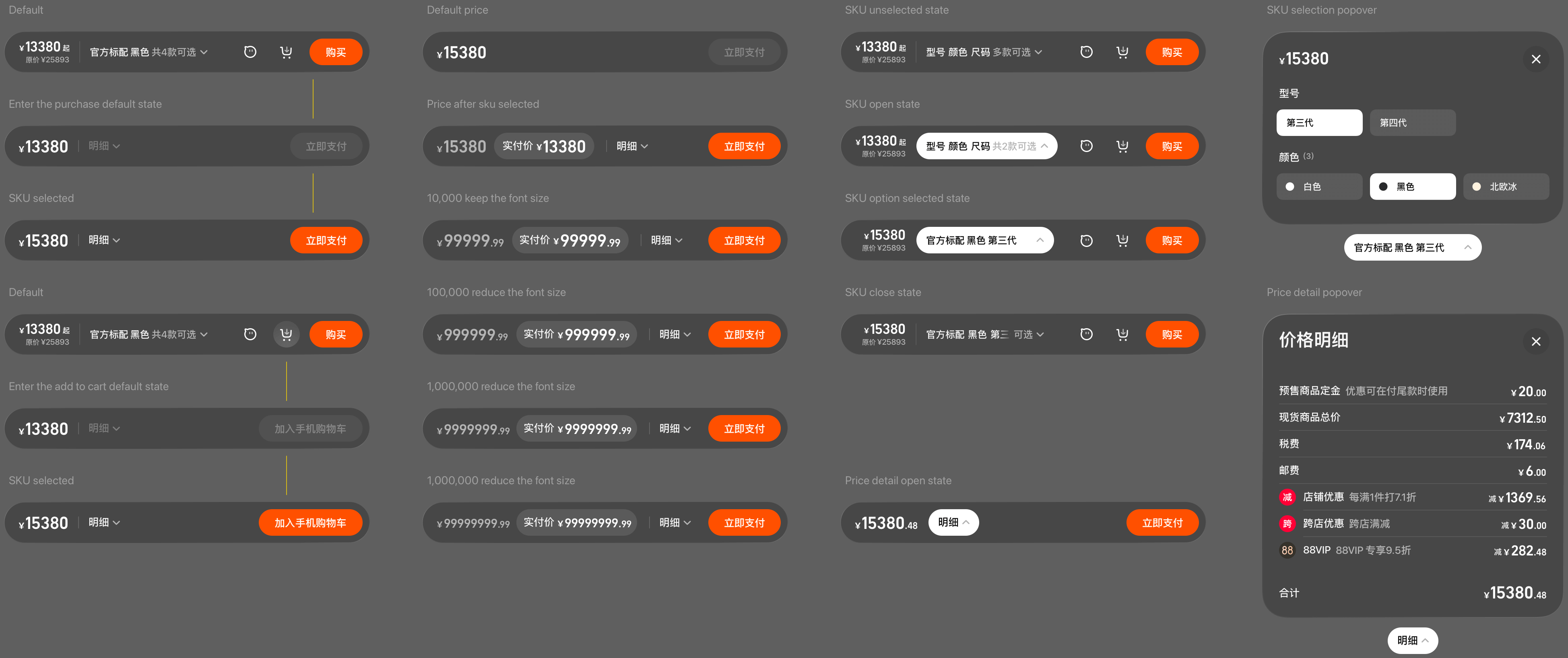
Detail Toolbar ↑
The toolbar includes information and controls such as price (discounted and original), quick SKU selection, messages, add to cart, and buy now. Controls adapt to the page state. Panels for quick SKU selection and price details appear as popovers.
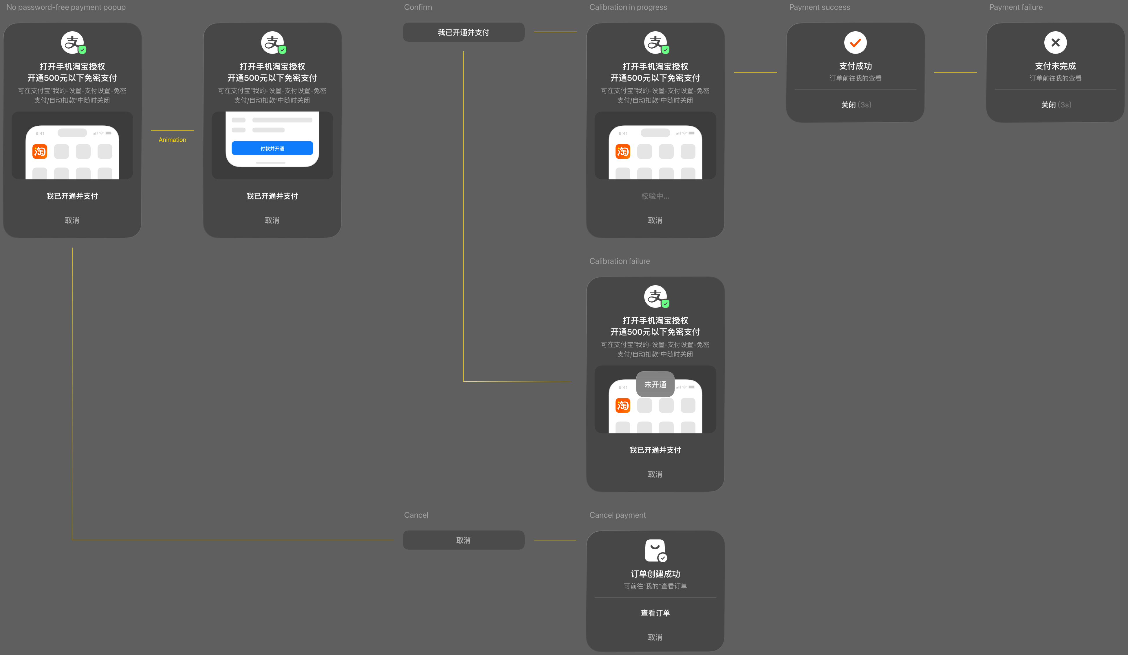
Payment Path Design ↑
In Taobao Vision Pro version, payments under ¥500 support password-free transactions. For higher amounts or if password-free payment is not enabled, payment can be completed via mobile. The dual-end option of password-free or mobile-assisted payment balances security and efficiency. During cross-device payment, users do not need to remove the headset, as the mobile Taobao app automatically launches the payment or password-free setup interface for immediate use.
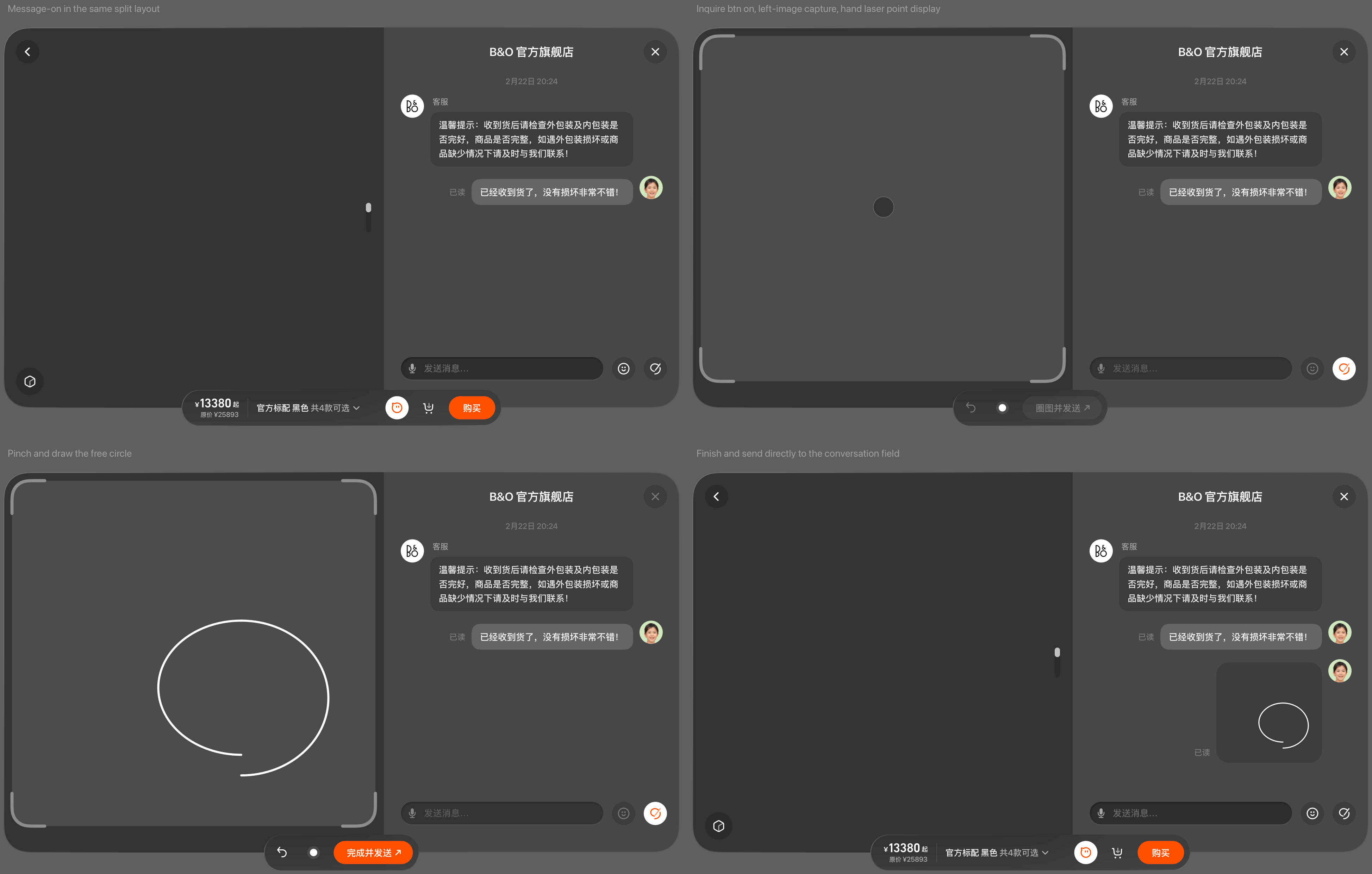
Message Circle Screenshot Feature ↑
In the product inquiry scenario, an interactive screenshot and annotation feature was added. Users no longer need to go through the lengthy process of taking a screenshot, marking it in the gallery, and returning to the app to send it to the seller. The interaction is simplified to three steps: open the chat dialog → screenshot & annotate on the same screen → send directly within the dialog.
Three-Point Bare-Hand Targeting ↑
A hand-ray cursor is used to avoid interference caused by eye-gaze cursors, which can obscure the target point and affect line-start accuracy when drawing circles.
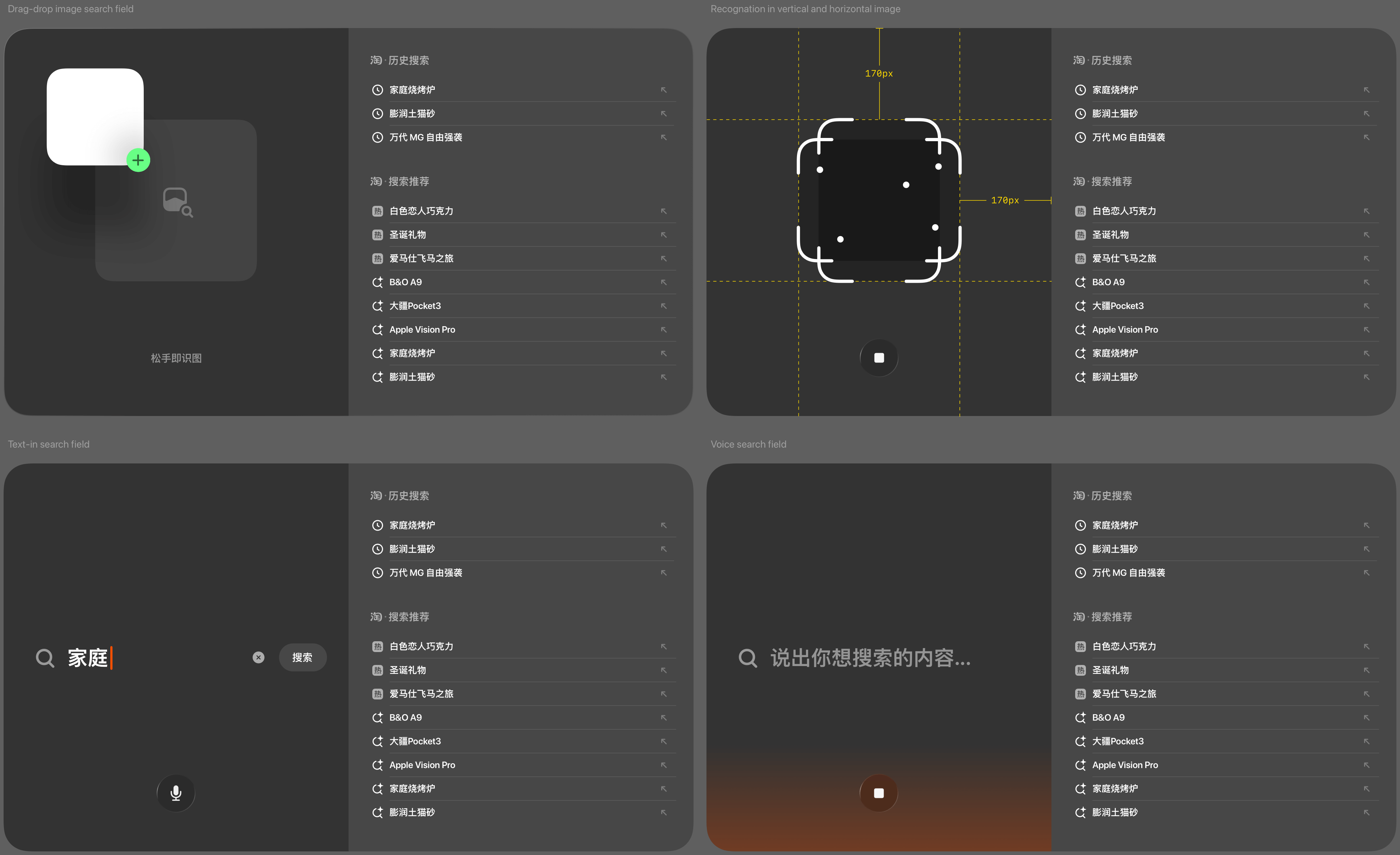
Search Design ↑
Expand the small-screen search box into a large-screen search area, restructure multimodal search prioritization (voice > drag and drop image search > text) for clearer affordance. Users can search for products by dragging images from other apps in a shared space, voice and text search.
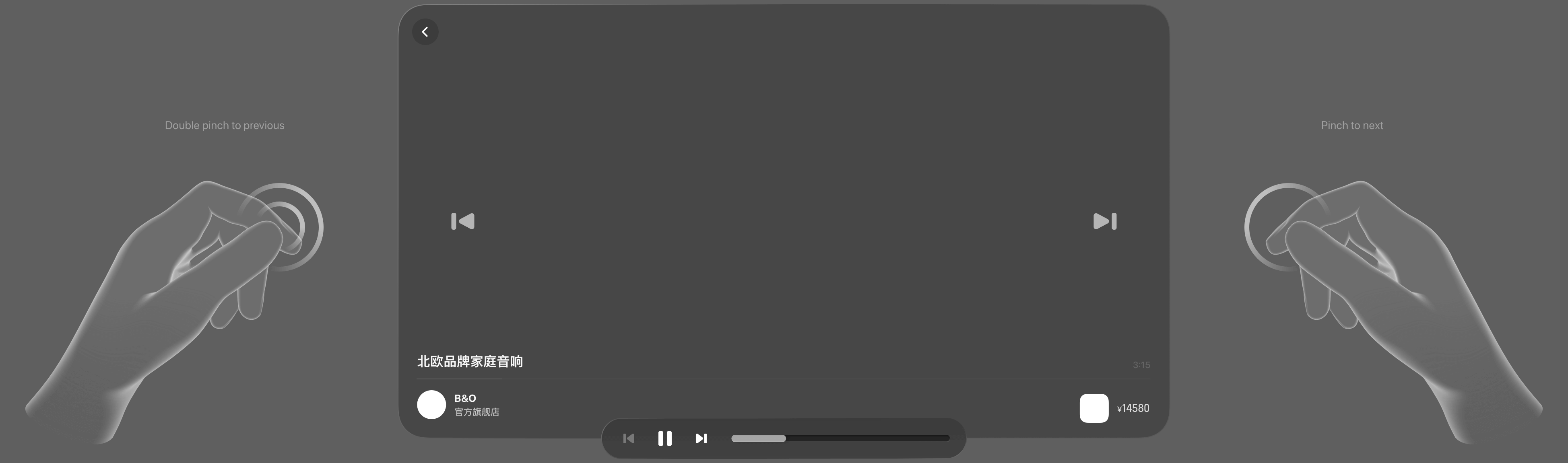
Video Browsing Design ↑
Users can watch larger, more immersive, and more three-dimensional brand and product videos. Quick video switching is performed with minimal effort by pinching the left or right areas of the video window. For short product or brand videos, gestures are assigned according to operation frequency, from easiest to most complex: next video > previous video > pause. On Apple Vision Pro, the most effortless action is a single pinch, similar to using a TV remote: one pinch switches to the next video, two pinches switch to the previous video.
Multi-Product Comparison Design ↑
Users can merge multiple product windows into a single interface for comparison. Opening each product detail in a separate window would create clutter and confusion. A “page linkage” feature allows users to operate one product page to simultaneously update all other product pages for quick comparison of the same type of information. To support this, product information is standardized vertically, ensuring that corresponding data fields align across all items.
Brand Space Mode Design ↑
Two paradigms are offered for experience design to give merchants a choice:
1. Window-shopping Mode (multi-product space)
2. Storytelling Mode (single product space)
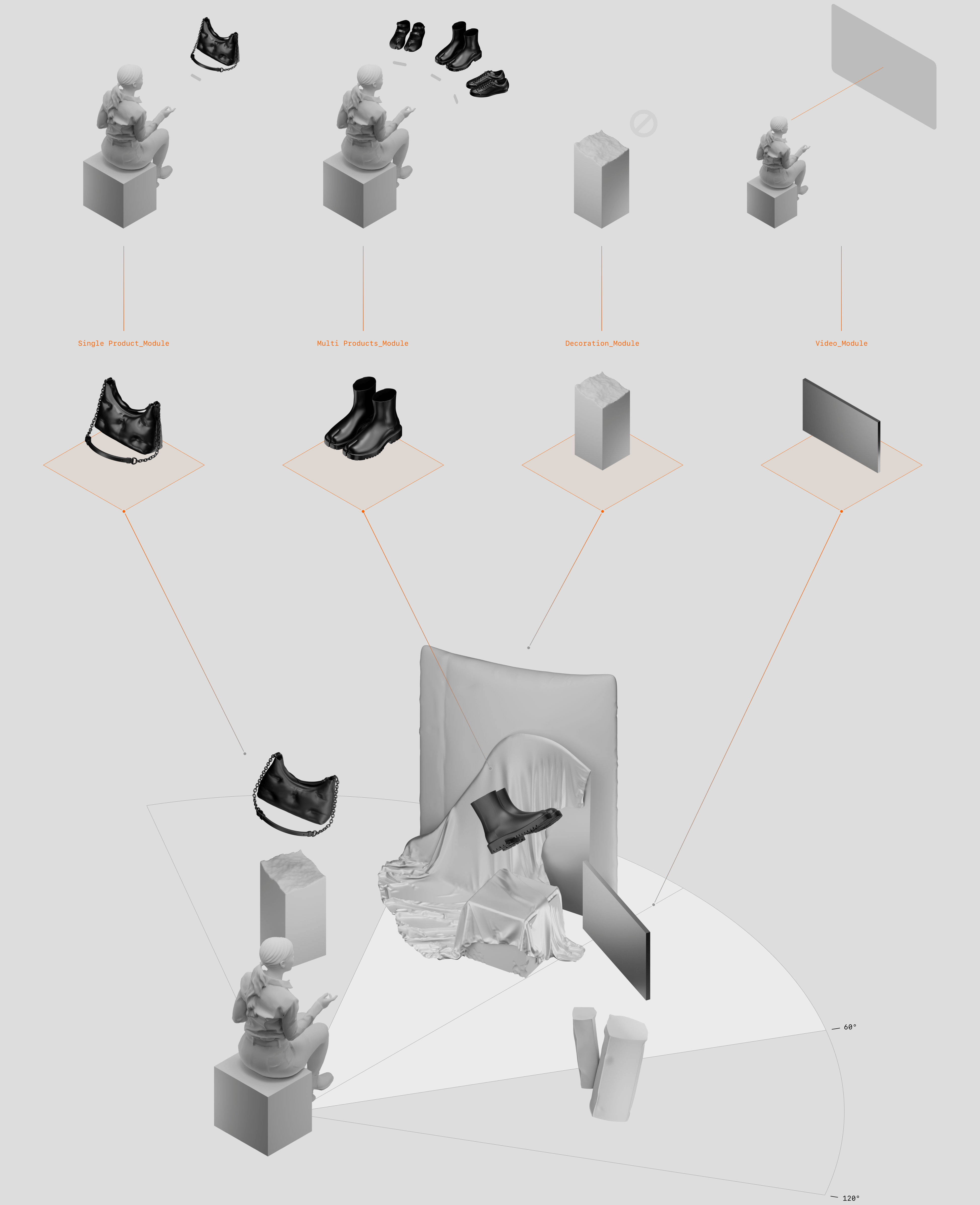
The first mode is suitable for displaying and interacting with multiple products. Through the way of multi-commodity, multimedia combination display space, it enables users to understand the brand in a non-linear experience. The platform provides multiple types of modules such as commodities, videos, decorations, brand logos, etc., and each module interaction is pre-productized so that brands can freely build their space.
Taking Maison Margiela as a case, there are four types of modules. The single-item module, when pinched, flies to the front of the user for a close-up view and interaction. The multi-item module, when pinched, surrounds the user to expand the viewing space. The video module, when pinched, enters immersive movie viewing. Additionally, there are decoration modules and virtual environments.
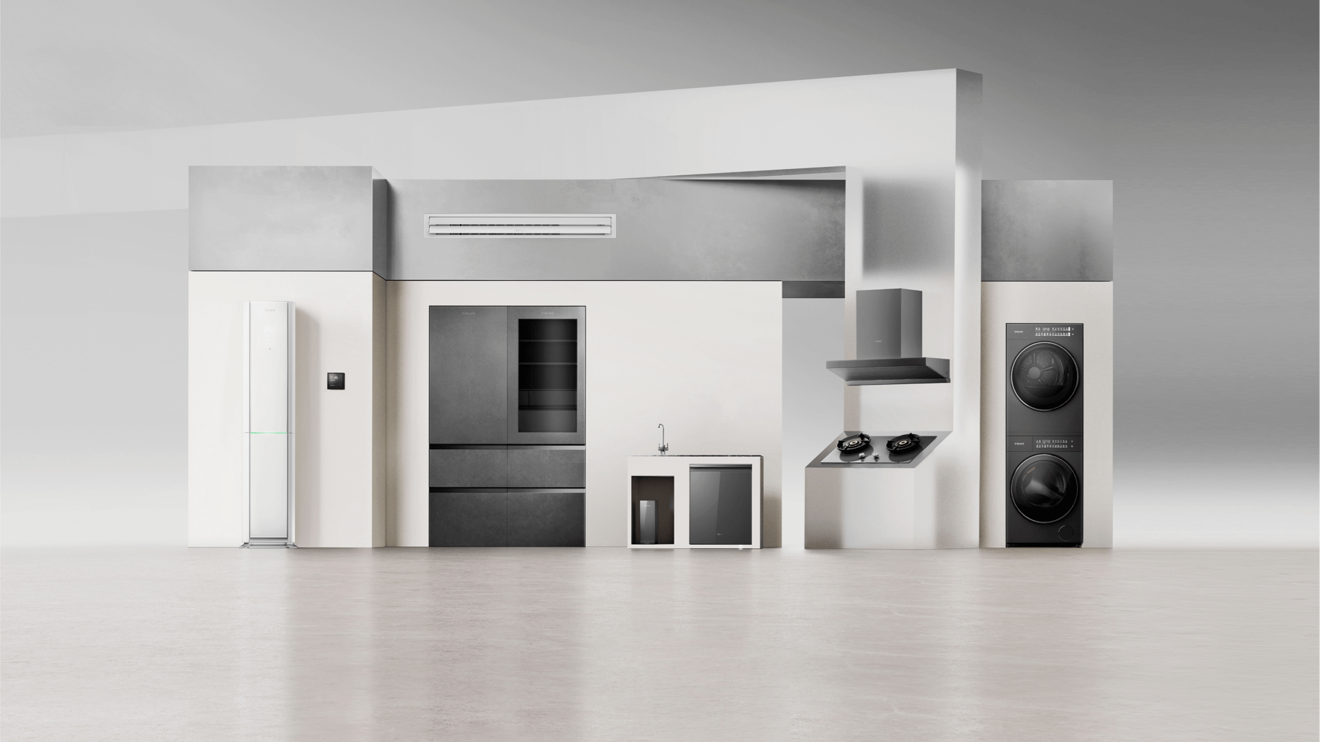
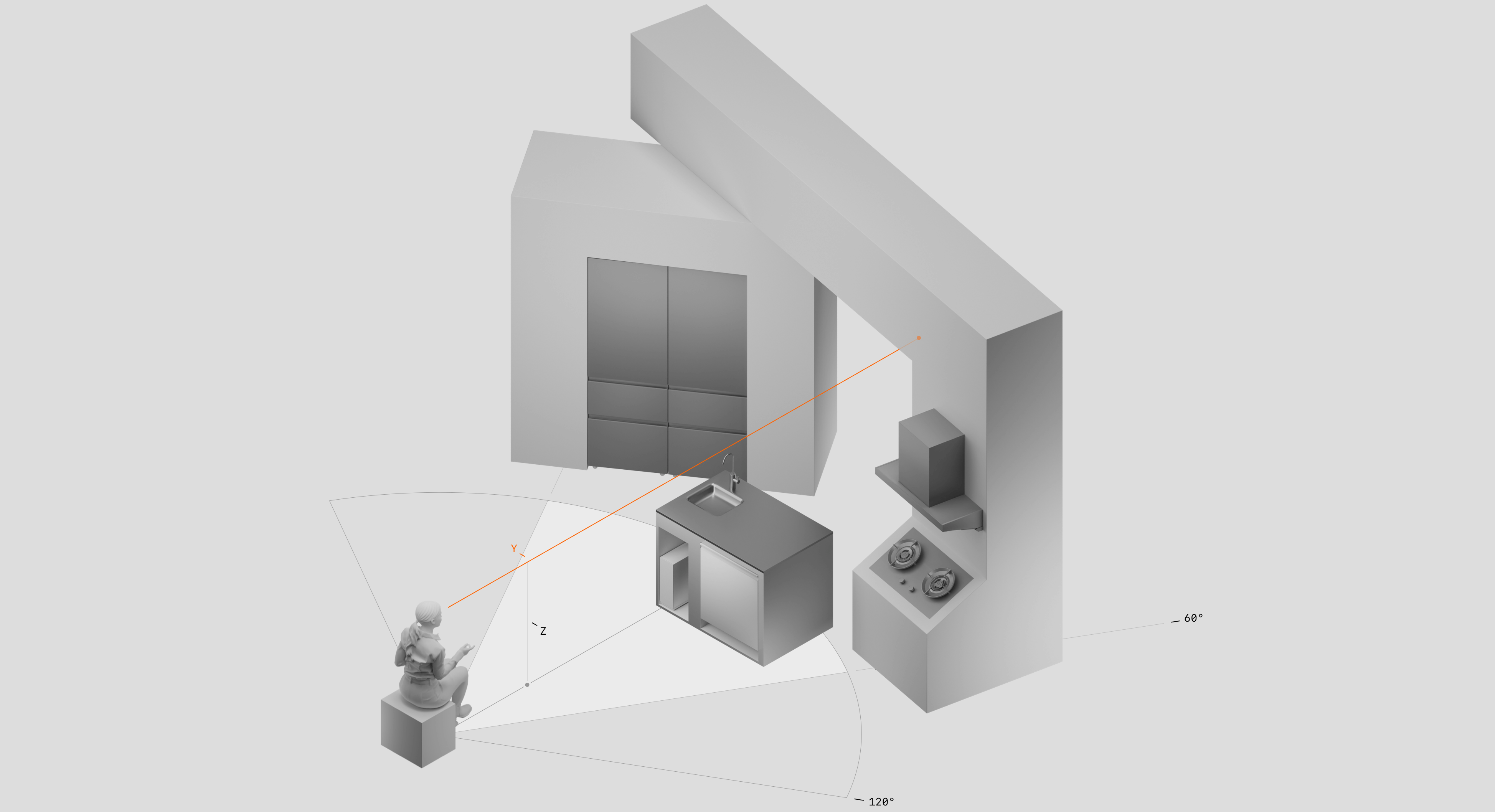
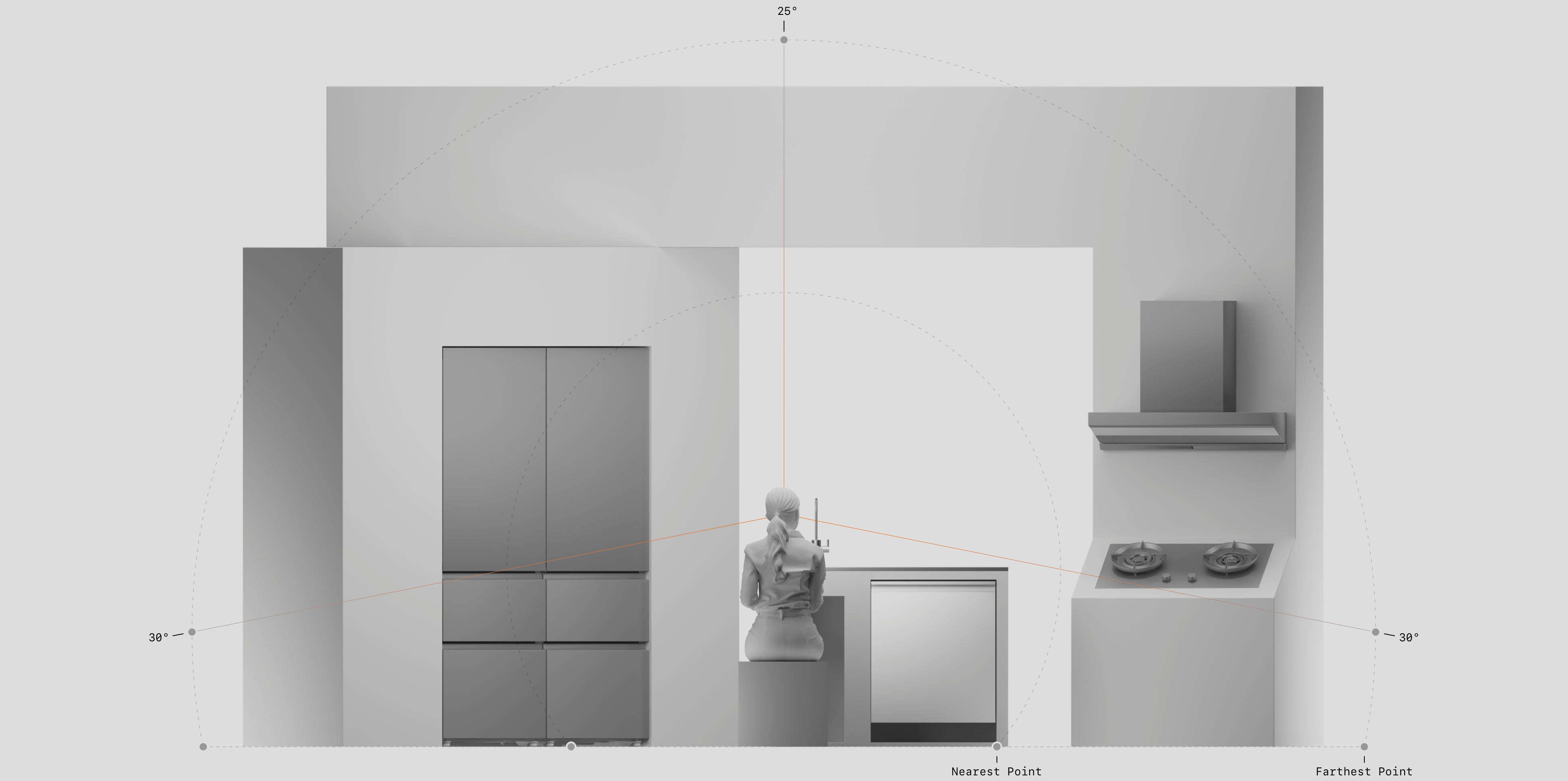
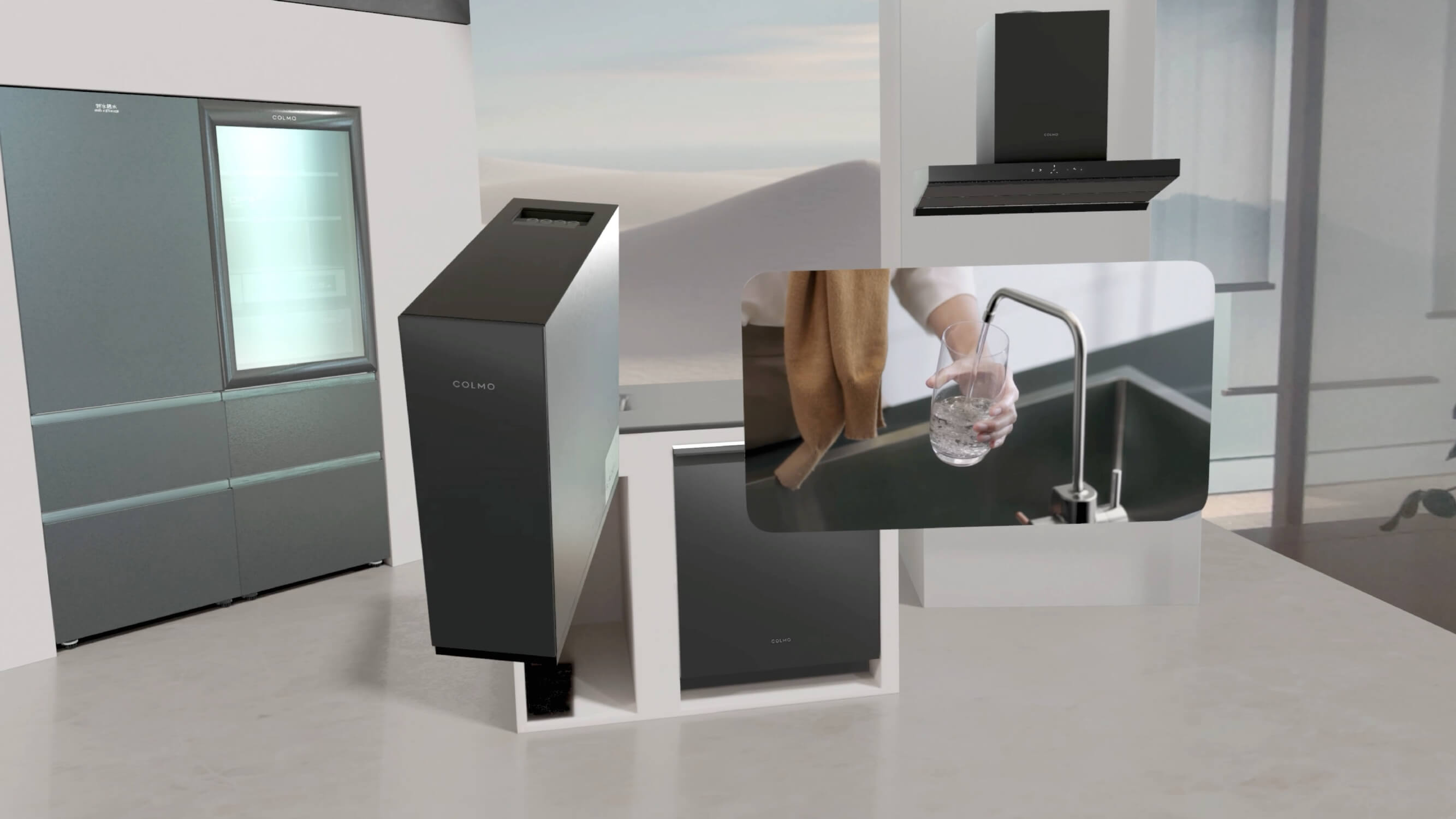
Compound Space Layout ↑
Taking the Colmo home appliance space as an example, this multi-module setup forms an integrated whole, adhering to the principles of directness and usability. Unlike the detail display, in this immersive brand space, all products are at 1:1 scale, and the arrangement falls within a 90-degree field of view.
Compound Space Layout ↑
The overall layout creates a semi-enclosed sense of immersion and visual impact around the user.
Compound Space Layout ↑
Due to the large overall scale, some elements are inevitably positioned far from the user. However, users do not need to stand or walk through the space; by remaining seated and using indirect interaction, all items can fly to the front for a close-up view.
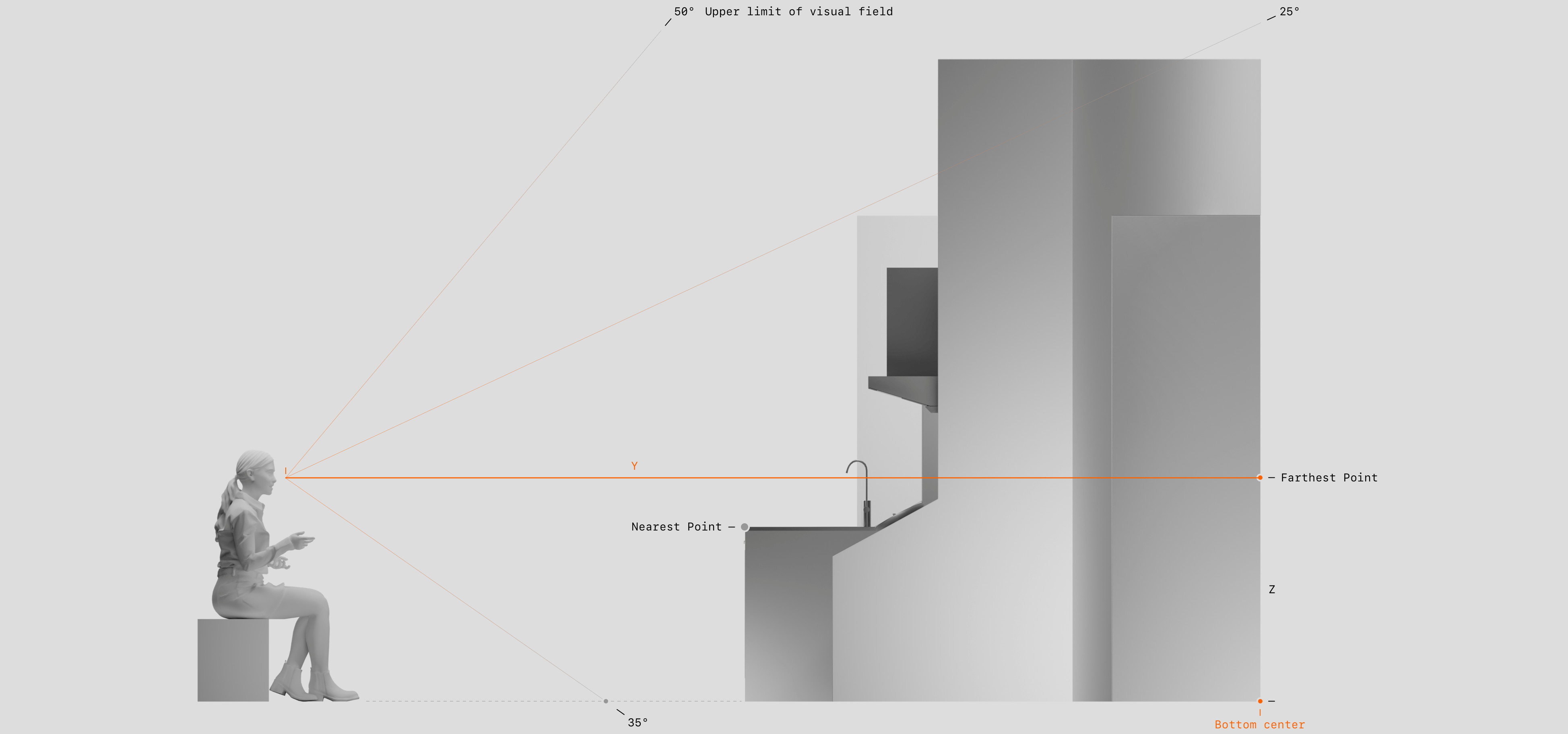
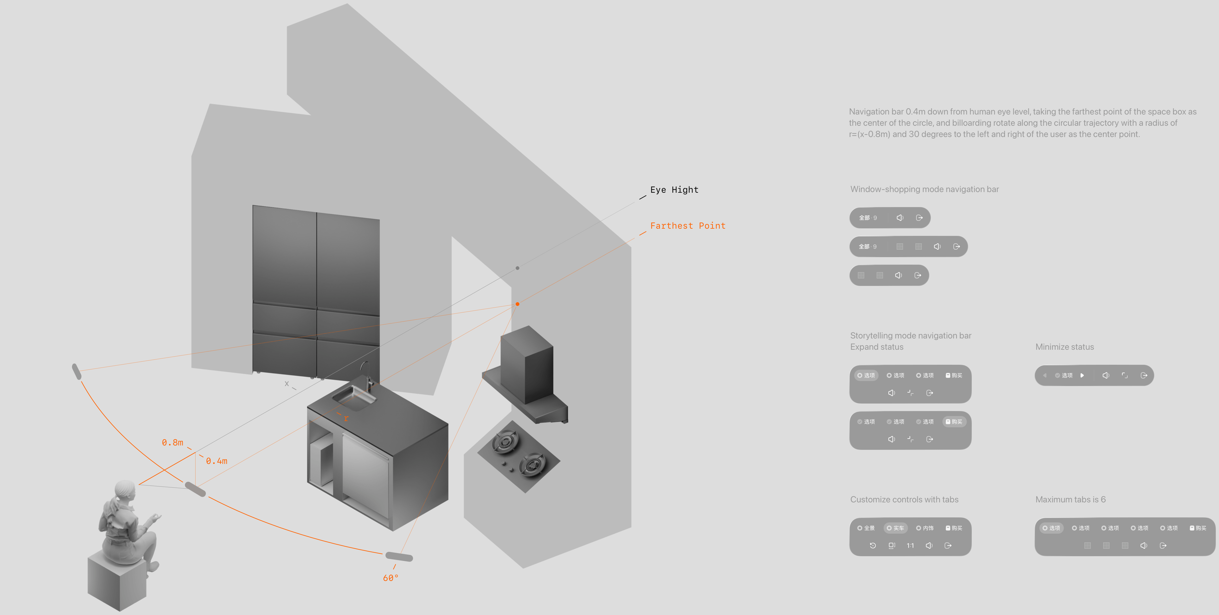
Space Navigation Bar Design ↑
The navigation bar moves along a 60-degree fan-shaped trajectory, centered on the farthest point of the overall layout, using billboarding. This allows users to easily discover controls, interact, and quickly locate the exit.
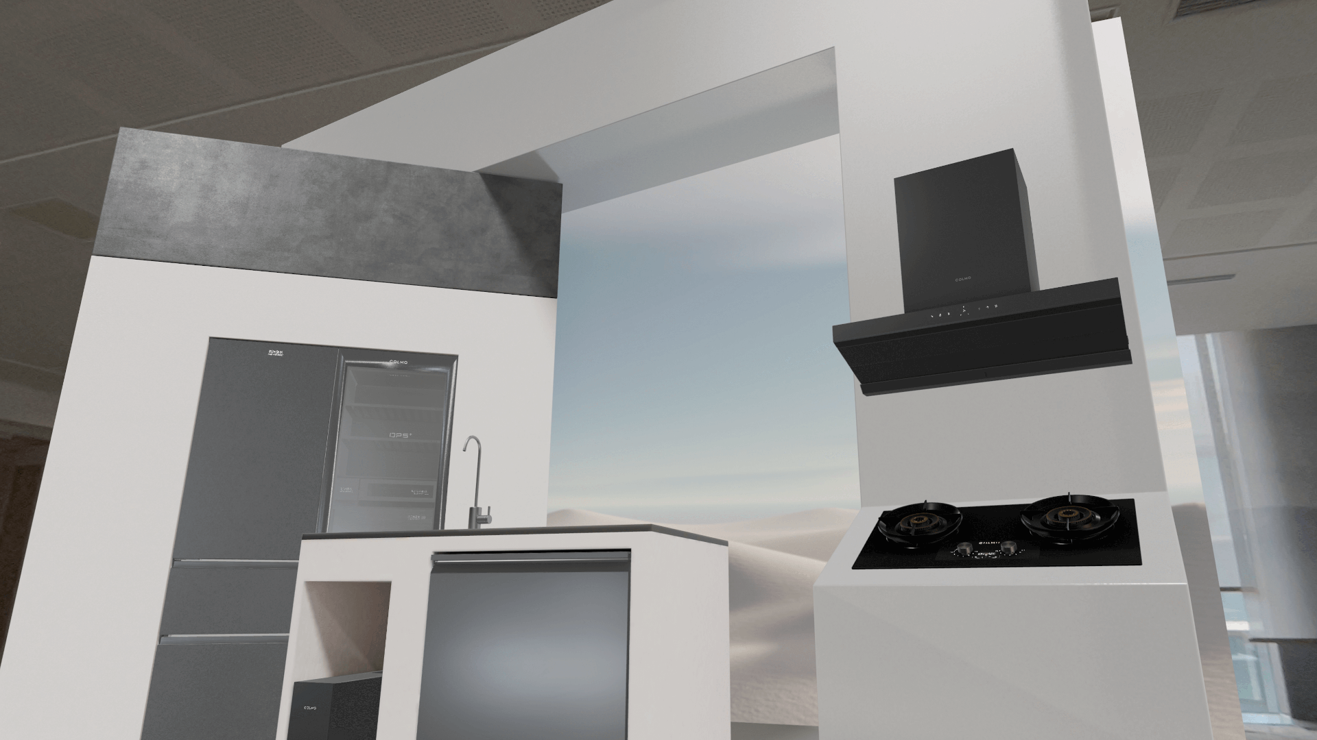
Screenshot of Window-shopping Mode ↑
1: Home appliance display space integrated with the real environment.
2: Screenshot showing an item flying close to the user for detailed viewing upon selection.
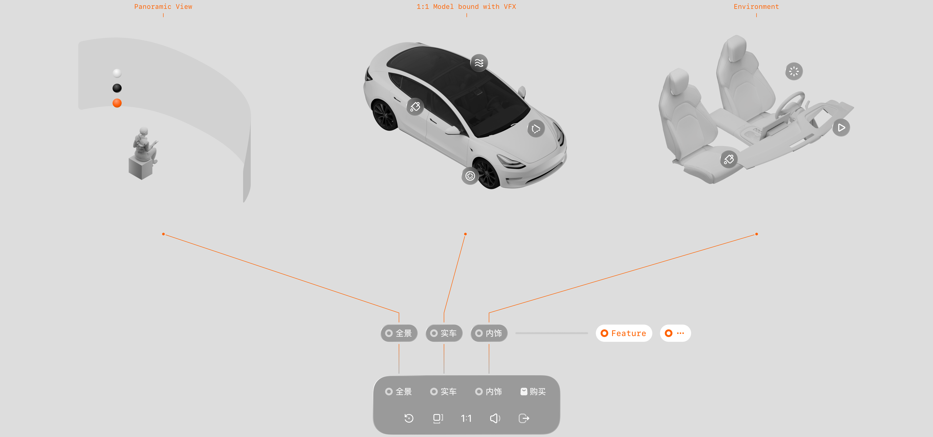
Single-Product Space Mode ↑
This mode is suitable for displaying and interacting with individual items. By highlighting each product feature sequentially, users can understand the product from start to finish in a linear experience. For each feature, appropriate technical setups and interaction methods are selected to present the highlights in the most intuitive and immersive way.
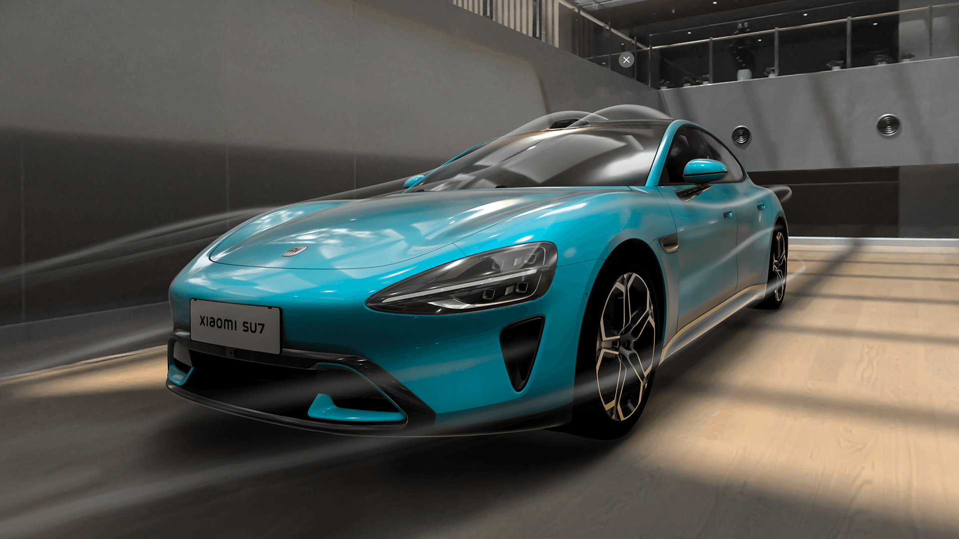
Taking the Xiaomi SU7 as an example, the experience is divided into:
1-Panoramic Vehicle View. High-resolution interior and exterior images are presented across multiple scenes using a panoramic window.
2-Exterior Model. High-precision 3D models with floating points and animation effects showcase exterior highlights.
3-Interior Cabin. Virtual reality models combined with environment maps display interior highlights.
Screenshot of Single-Product Storytelling Mode ↑
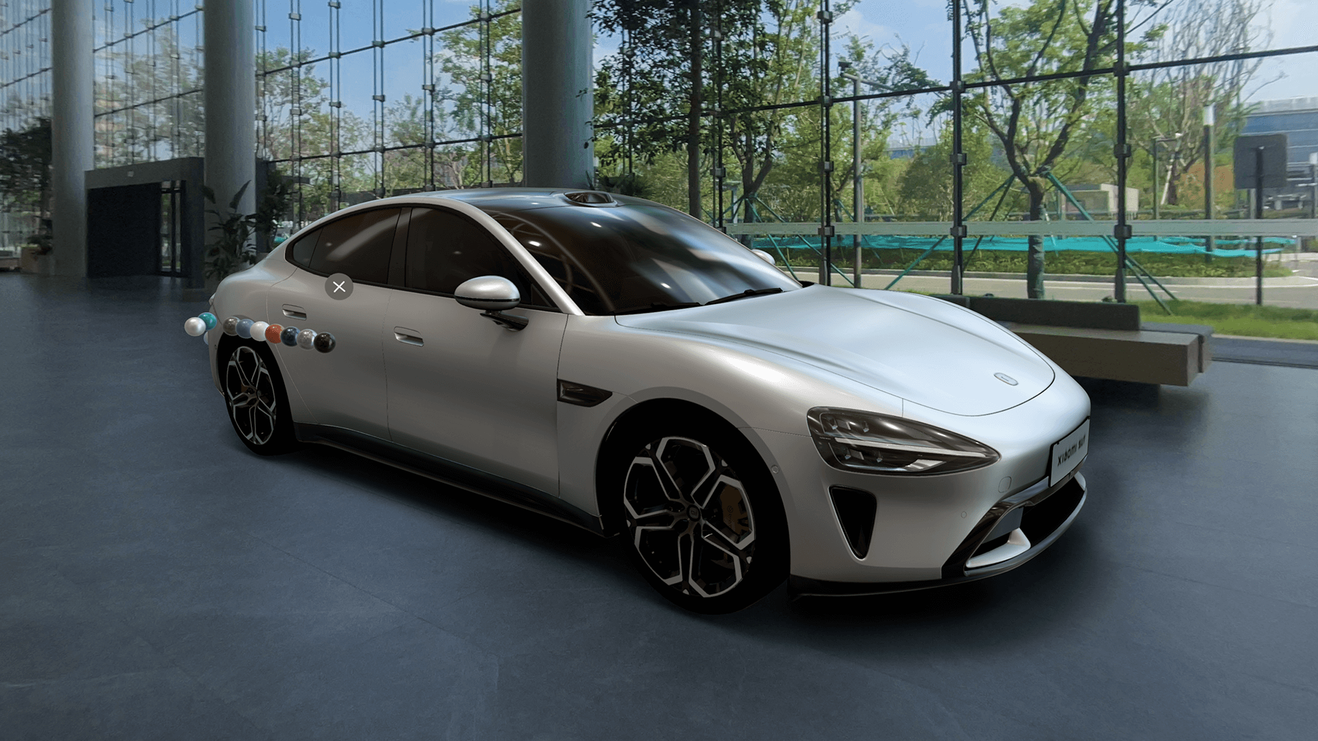
1: Screen recording of the exterior model, demonstrating color switching via floating points.
2: Experience of switching interior colors and materials.
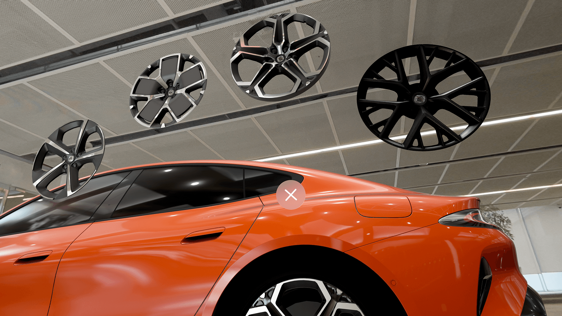
3: Experience of changing the wheel rims. This illustrates the use of model floating points and bounding information — essentially, interactions in brand space are a combination of foundational interactions, including size rules, scaling, and rotation.
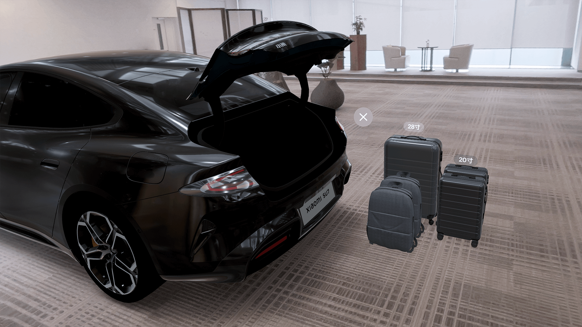
4: Opening the trunk reveals a suitcase model, with a click triggering the placement animation, intuitively demonstrating trunk space. This is an example of reducing fatigue and improving usability by using indirect interaction rather than fully mimicking the luggage placement action, efficiently conveying product highlights.
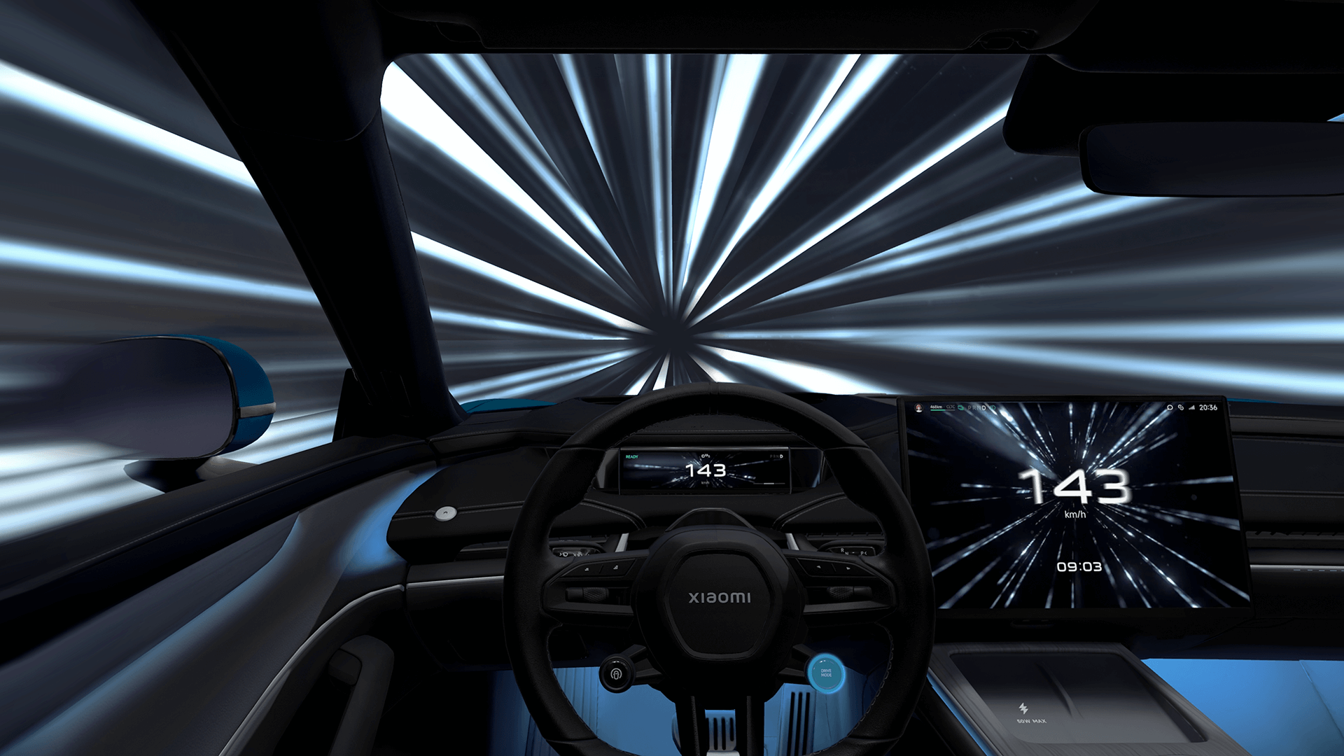
5: “Boost Mode” experience, using panoramic dynamic environment mapping.
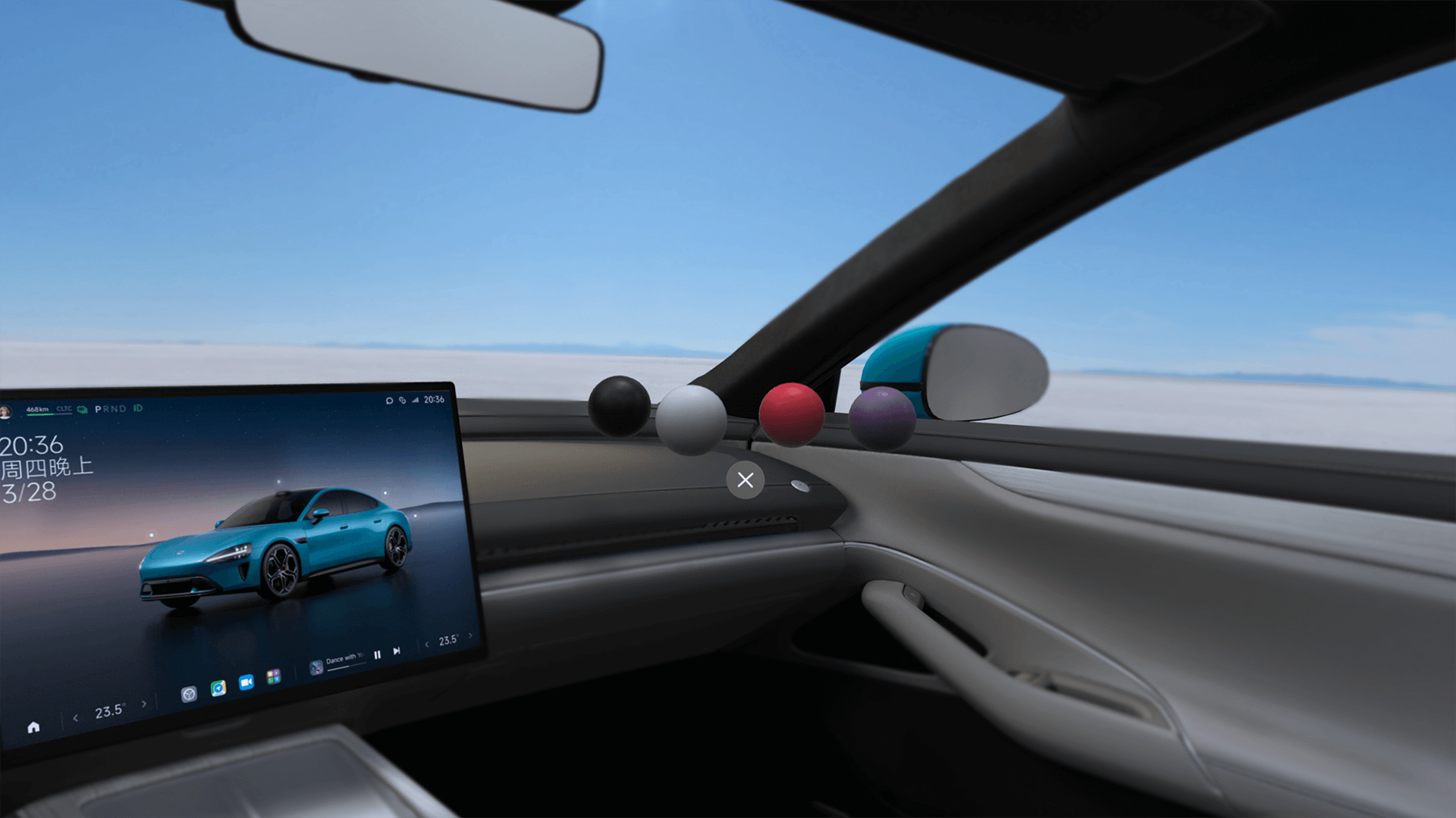
6: Vehicle start experience in the interior cabin. The cockpit is rendered at 1:1 scale, allowing users to reach and press the start button directly, creating a natural and intuitive experience.
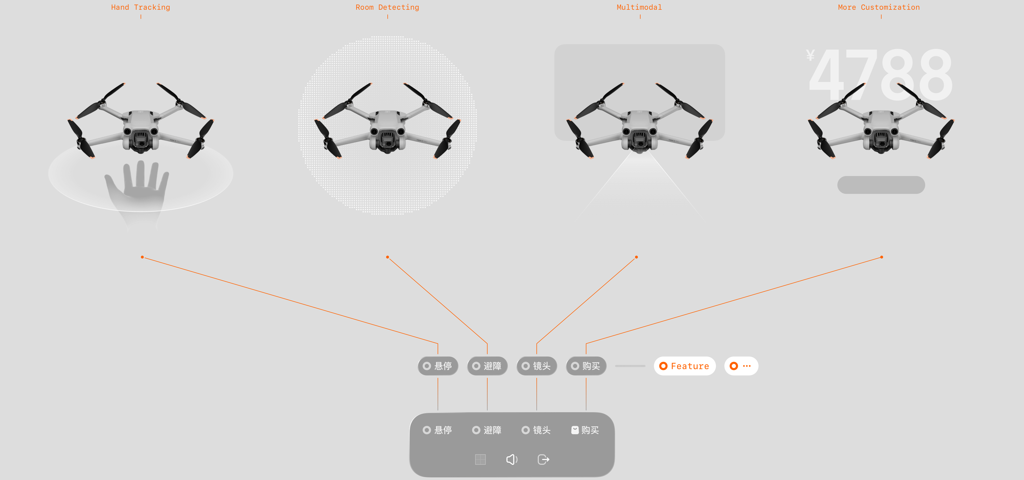
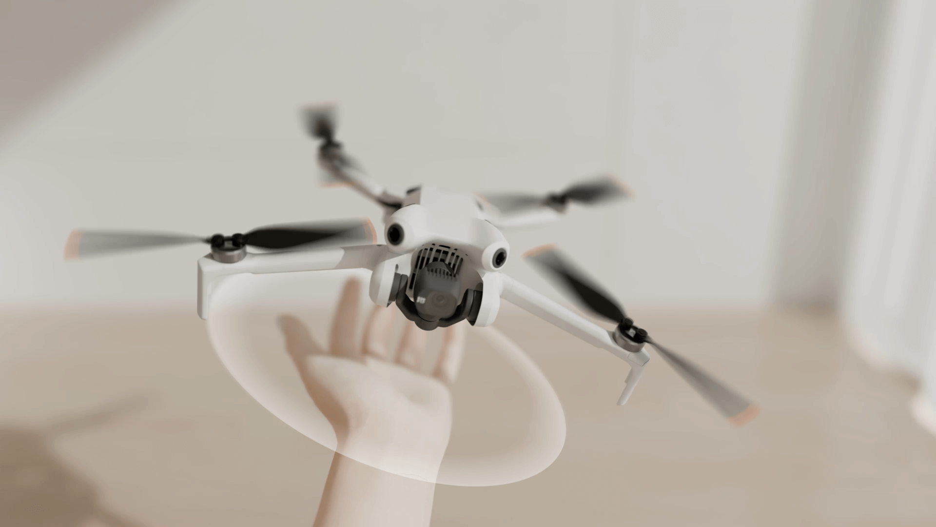
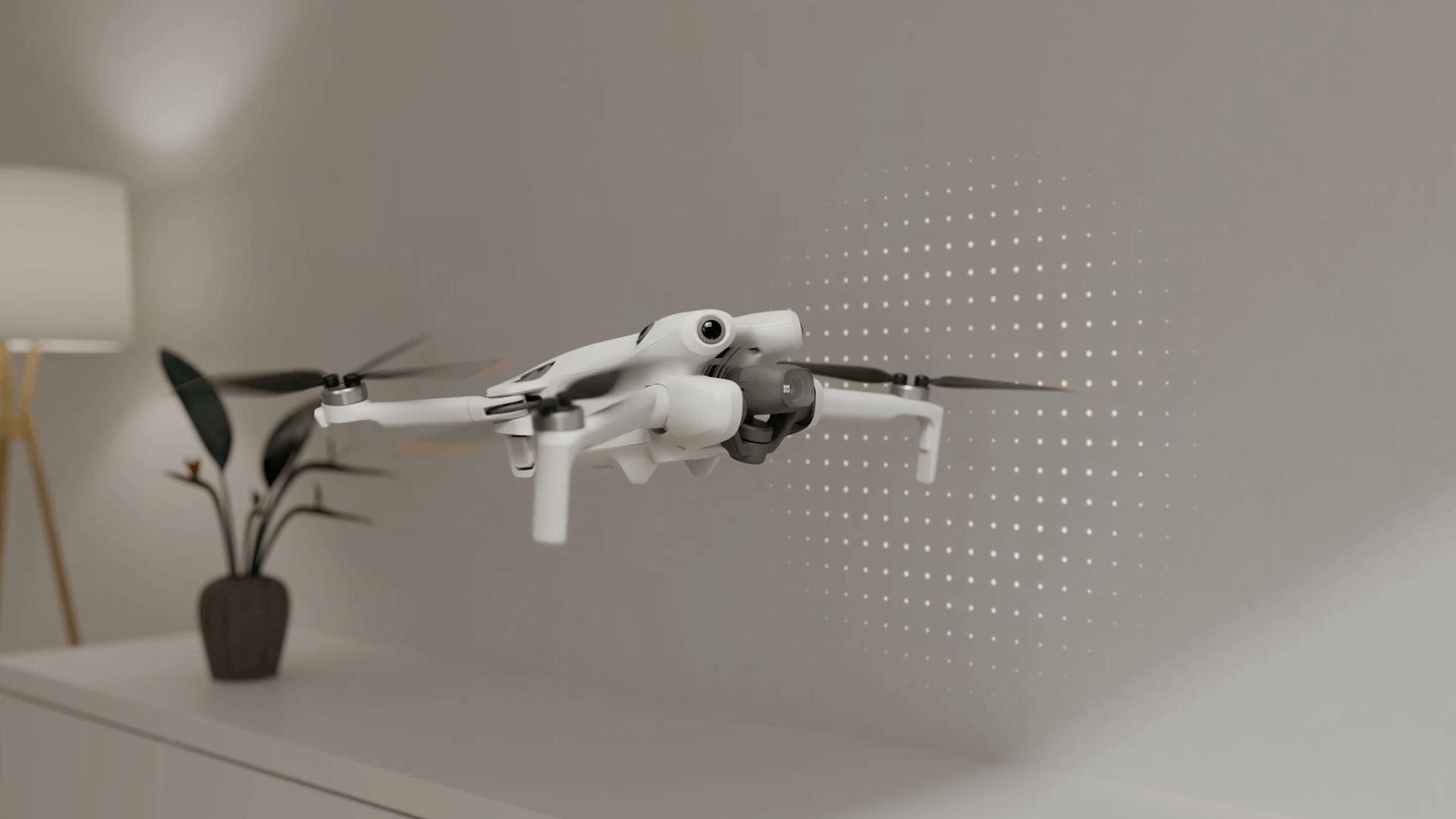
Linear Storytelling Function for Drone ↑
Another example of storytelling mode is the DJI drone experience. The entire experience is divided into:
1-Handheld Hovering. Controlled using bare-hand recognition.
2-Automatic Obstacle Avoidance. Enabled through environment detection.
3-Camera Introduction. Presented via a combination of window display and model animation.
Screenshot of Single-Product Storytelling Mode ↑
1: 3D animated display of the brand logo.
2: Demonstration of hovering handheld effect.
3: Demonstration of automatic obstacle avoidance.
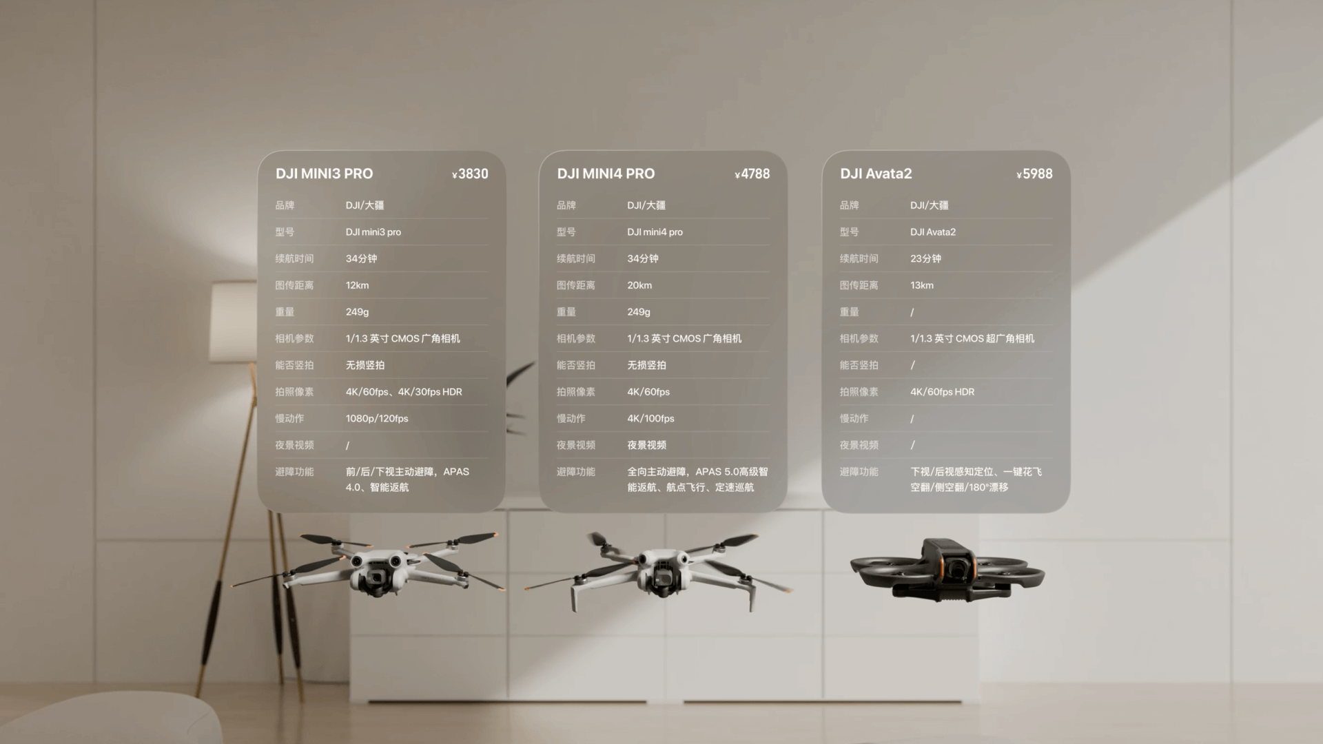
4: Display of multi-product parameter comparison.
Taobao Vision Pro version hosts hundreds of millions of products and tens of thousands of merchants, offering product models, images, videos, and multimedia content to provide shopping experiences and services unavailable on other e-commerce platforms. The team's exploration of experience design for digital shopping using mixed reality devices received professional recognition and encouragement:
iF Design Award in the User Experience (UX) category →
Red Dot Award in Interface & User Experience Design →
Apple Design Award in the Interaction Category →
Keke LE
MPID Multi-platform Innovation Design
Taobao Design Sub-unit
Alibaba Group © All rights reserved.
The certain content or data have been hidden due to the undisclosure agreement.